
iOS Text and Fields
SwiftUI Text, Label, TextField, SecureField, and TextEditor under One.iOS
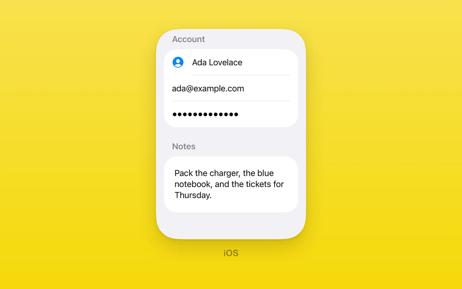
One.iOS text display and entry are SwiftUI’s own views: Text, Label,
TextField, SecureField, and TextEditor, each in a Fabric view with the
field state kept in a native model. The fields take a plain string or a
NativeState handle, and focus is controlled through props. Keyboard,
autocapitalization, AutoFill, and style options are SwiftUI modifiers set
through swiftStyle.
Reach for these when a screen is iOS only and should feel like the system: form labels, field styles, and the native return key. For a field that also runs on Android and web, use One.UI.TextInput instead.
Usage
import { One, useNativeState } from 'one'
export function SignIn({ signIn }: { signIn: () => void }) {  const email = useNativeState('')  const password = useNativeState('')
  return (    <One.iOS.Form style={{ flex: 1 }}>      <One.iOS.Section>        <One.iOS.TextField          label="Email"          prompt="you@example.com"          text={email}          onTextChange={(value) => email.set(value)}          swiftStyle={{            keyboardType: 'emailAddress',            textContentType: 'username',            textInputAutocapitalization: 'never',            submitLabel: 'next',          }}        />        <One.iOS.SecureField          label="Password"          prompt="Password"          text={password}          onTextChange={(value) => password.set(value)}          swiftStyle={{ textContentType: 'password', submitLabel: 'go' }}          onSubmit={signIn}        />      </One.iOS.Section>    </One.iOS.Form>  )}
Each field binds to a handle, so typing writes native memory directly and the
component re-renders with the new value. The username and password content
types mark the pair as a login form for AutoFill.
Every view on this page also accepts accessibilityLabel,
accessibilityHint, accessibilityValue, testID, style, onLayout, and
swiftStyle.
How it works
The text lives in the native field’s model, which keeps the value plus an
event count and a revision. Each keystroke bumps the count and reports the new
text; JavaScript writes it into the bound handle, calls the change handler, and
acknowledges the event. Writes through the handle converge silently with no
echo back. Passing a new text with an increased revision resets the field
from the outside; without the bump, an unacknowledged native edit wins.
Focus works the same way as a second controlled value with its own revision:
set focused to move focus in or out, read moves through onFocusChange.
axis and the swiftStyle modifiers take SwiftUI names checked against the
device’s iOS version.
TextField
TextField is a single line field, or a growing multi-line field with
axis="vertical", which SwiftUI expands as text wraps.
import { One, useNativeState } from 'one'
function Nickname() {  const name = useNativeState('')
  return (    <One.iOS.TextField      label="Nickname"      prompt="Ada"      text={name}      onTextChange={(value) => name.set(value)}      swiftStyle={{ textFieldStyle: 'roundedBorder' }}    />  )}
For a multiline field that grows from one to five lines, use the range overload:
<One.iOS.TextField label="Message" text={message} onTextChange={(value) => message.set(value)} axis="vertical" swiftStyle={{ lineLimitWithClosedRange: { limit: { lower: 1, upper: 5 } } }}/>Here message is a string handle from useNativeState. Range bounds are
integers with lower <= upper. For a single maximum, the existing
lineLimitWithOptionalInt: 5 modifier remains available.
| Props | Type | Description |
|---|---|---|
text (required)string | NativeState<string>The text. A NativeState handle from useNativeState keeps keystrokes off the React render. | string | NativeState<string> | The text. A NativeState handle from useNativeState keeps keystrokes off the React render. |
onTextChange (required)(value: string) => voidA native edit, with the new text. | (value: string) => void | A native edit, with the new text. |
revisionnumber = 0Increase with a new text to reset it from outside. | number = 0 | Increase with a new text to reset it from outside. |
focusedbooleanWhether the field has focus. Controlled like text. | boolean | Whether the field has focus. Controlled like text. |
onFocusChange(focused: boolean) => voidFocus moved in or out. | (focused: boolean) => void | Focus moved in or out. |
focusRevisionnumber = 0Increase with a new focused to apply it from outside. | number = 0 | Increase with a new focused to apply it from outside. |
onSubmit() => voidReturn was pressed. | () => void | Return was pressed. |
labelstring = ""The accessibility label. | string = "" | The accessibility label. |
promptstring = ""The placeholder. | string = "" | The placeholder. |
axisAxis = "horizontal"vertical grows the field to more lines as text wraps. | Axis = "horizontal" | vertical grows the field to more lines as text wraps. |
textFieldStyle, submitLabel, textInputAutocapitalization,
autocorrectionDisabled, keyboardType, textContentType, and disabled are
SwiftUI modifiers set through swiftStyle. keyboardType and textContentType
take SwiftUI’s case names, such as URL or oneTimeCode, and a
textContentType of null means none.
SecureField
SecureField obscures its input for passwords. It takes the same props as
TextField except axis.
import { One, useNativeState } from 'one'
function Password({ signIn }: { signIn: () => void }) {  const password = useNativeState('')
return ( <One.iOS.SecureField label="Password" prompt="Password" text={password} onTextChange={(value) => password.set(value)} swiftStyle={{ textContentType: 'password', submitLabel: 'go' }} onSubmit={signIn} /> )}| Props | Type | Description |
|---|---|---|
text (required)string | NativeState<string>The text. A NativeState handle from useNativeState keeps keystrokes off the React render. | string | NativeState<string> | The text. A NativeState handle from useNativeState keeps keystrokes off the React render. |
onTextChange (required)(value: string) => voidA native edit, with the new text. | (value: string) => void | A native edit, with the new text. |
revisionnumber = 0Increase with a new text to reset it from outside. | number = 0 | Increase with a new text to reset it from outside. |
focusedbooleanWhether the field has focus. Controlled like text. | boolean | Whether the field has focus. Controlled like text. |
onFocusChange(focused: boolean) => voidFocus moved in or out. | (focused: boolean) => void | Focus moved in or out. |
focusRevisionnumber = 0Increase with a new focused to apply it from outside. | number = 0 | Increase with a new focused to apply it from outside. |
onSubmit() => voidReturn was pressed. | () => void | Return was pressed. |
labelstring = ""The accessibility label. | string = "" | The accessibility label. |
promptstring = ""The placeholder. | string = "" | The placeholder. |
SecureField takes the same swiftStyle modifiers as TextField.
TextEditor
TextEditor is SwiftUI’s multi-line editor. Return inserts a newline, and the
editor fills the box it is given, so give it a height. SwiftUI’s editor has no
label, placeholder, style, or submit; name it with accessibilityLabel.
import { One, useNativeState } from 'one'
function Notes() {  const notes = useNativeState('')
return ( <One.iOS.TextEditor text={notes} onTextChange={(value) => notes.set(value)} accessibilityLabel="Notes" style={{ height: 160 }} /> )}| Props | Type | Description |
|---|---|---|
text (required)string | NativeState<string>The text. A NativeState handle from useNativeState keeps keystrokes off the React render. | string | NativeState<string> | The text. A NativeState handle from useNativeState keeps keystrokes off the React render. |
onTextChange (required)(value: string) => voidA native edit, with the new text. | (value: string) => void | A native edit, with the new text. |
revisionnumber = 0Increase with a new text to reset it from outside. | number = 0 | Increase with a new text to reset it from outside. |
focusedbooleanWhether the field has focus. Controlled like text. | boolean | Whether the field has focus. Controlled like text. |
onFocusChange(focused: boolean) => voidFocus moved in or out. | (focused: boolean) => void | Focus moved in or out. |
focusRevisionnumber = 0Increase with a new focused to apply it from outside. | number = 0 | Increase with a new focused to apply it from outside. |
textInputAutocapitalization, autocorrectionDisabled, keyboardType,
textContentType, and disabled are SwiftUI modifiers set through
swiftStyle.
Text
Text renders one string.
import { One } from 'one'
function Greeting({ name }: { name: string }) { return <One.iOS.Text text={`Hello, ${name}`} />}| Props | Type | Description |
|---|---|---|
textstringThe string to show. | string | The string to show. |
Label
Label renders a title with an SF Symbol.
import { One } from 'one'
function Favorite() { return <One.iOS.Label label="Favorites" systemImage="star" />}| Props | Type | Description |
|---|---|---|
labelstringThe title. | string | The title. |
systemImageSFSymbolName | ""An SF Symbol before the title. | SFSymbolName | "" | An SF Symbol before the title. |
Disable a label with swiftStyle={{ disabled: true }}.
Platform differences
| iOS | Android | Web | |
|---|---|---|---|
| Renders | SwiftUI fields | Throws | Throws |
| Keyboard | swiftStyle | None | None |
| AutoFill | swiftStyle | None | None |
Limits and gotchas
- Reset text with a revision bump. A new
textalone loses to an unacknowledged native edit; increaserevisionwith it to reset the field from the outside. Revisions must be nonnegative Int32 values. - Pick one focus owner. Setting both
focusedandswiftStyle.focusedthrows; use one or the other. - Style names are checked. Unknown SwiftUI names throw, as do styles that need a newer iOS than the device runs.
- SecureField is one line. SwiftUI’s
SecureFieldtakes no axis, so it has no multi-line mode.
Edit this page on GitHub.