
Android Icons
Material Symbols icons for the Android Compose surface
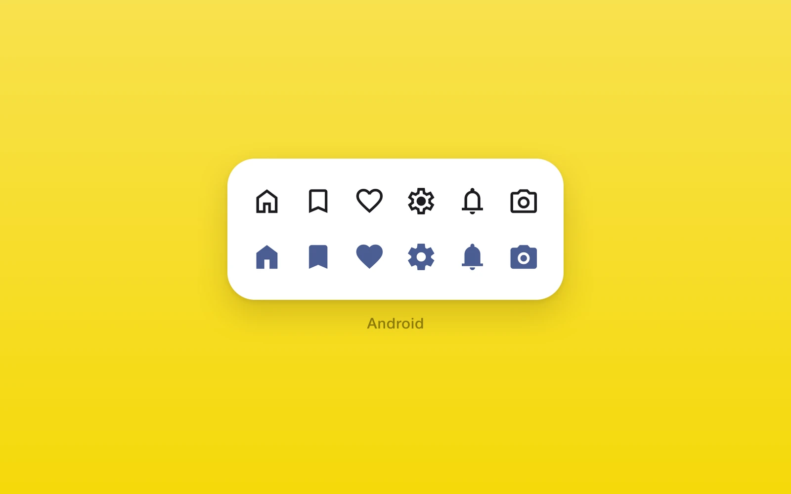
One.Android.Icon draws a Material Symbols icon inside a Compose tree. The
outlined and filled fonts are bundled, so icons render offline and without a
frame of delay.
Reach for it for any icon inside Compose content. For an icon that also
renders on iOS and web, use One.UI.Icon, which takes a
separate icon for each platform.
Usage
import { One } from 'one'
function NextRow({ next }: { next: () => void }) {  return (    <One.Android.Row spacing={12}>      <One.Android.Icon name="star" filled composeStyle={{ foregroundColor: '#FFC107' }} />      <One.Android.Button label="Next" icon="arrow_forward" onPress={next} />    </One.Android.Row>  )}
How it works
The icon looks its name up in the generated glyph table and draws the
codepoint from the bundled font at size dp. Unknown names throw when the
icon renders, and a non-positive size throws. composeStyle.foregroundColor
tints the glyph; an accessibilityLabel makes it read aloud, and without
one it is decorative. A Button’s icon and iconFilled take the same
names and follow the button’s content color.
| Props | Type | Description |
|---|---|---|
name (required)ComposeIconNameA Material Symbols name, such as star or arrow_forward. | ComposeIconName | A Material Symbols name, such as star or arrow_forward. |
sizenumber = 24The size in dp. Must be positive. | number = 24 | The size in dp. Must be positive. |
filledboolean = falseThe filled glyph instead of the outlined one. | boolean = false | The filled glyph instead of the outlined one. |
name takes the snake_case names from
fonts.google.com/icons. ComposeIconName
lists all 4,284, so a typo fails type checking, and an unknown name throws
when the icon renders. The icon also takes the shared node props from
Compose.
Platform differences
| iOS | Android | Web | |
|---|---|---|---|
| Renders | Throws | Bundled font | Throws |
| Names | None | 4,284 symbols | None |
Limits and gotchas
- Android only. The icon throws outside an Android build; keep those branches behind platform checks.
- Names are checked twice. A typo fails type checking, and an unknown name that slips through throws at render.
Edit this page on GitHub.