
Presentations and Menus
SwiftUI Sheet, FullScreenCover, Popover, Alert, ConfirmationDialog, QuickLook, and menus under One.iOS
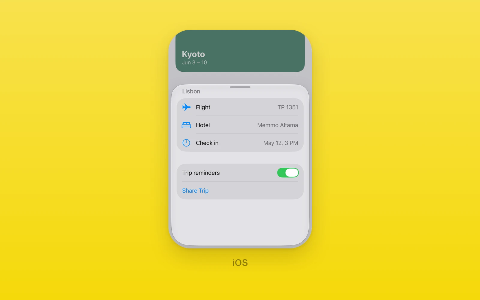
One.iOS modal presentations and menus are presented by the system: Sheet,
FullScreenCover, Popover, Alert, ConfirmationDialog, and QuickLook
from SwiftUI, and Menu and ContextMenu built from UIKit menu elements.
Every presentation is controlled, with isPresented, an
onIsPresentedChange callback, and a revision for resets from the outside.
Reach for a sheet for Peek-style detail over content, a full screen cover for an immersive task with its own close control, a popover for an anchored panel, an alert or confirmation dialog for a short choice, and a menu for a list of actions on a trigger. Every view here throws on web and Android.
Usage
import { useState } from 'react'import { Text } from 'react-native'import { One } from 'one'
function TripDetails() {  return <Text>Departs Oct 14, 9:30 AM.</Text>}
export function TripScreen() {  const [open, setOpen] = useState(false)
  return (    <>      <One.iOS.Button label="Details" onPress={() => setOpen(true)} />      <One.iOS.Sheet        isPresented={open}        onIsPresentedChange={setOpen}        presentationDetents={['medium', 'large']}        presentationDragIndicator="visible"      >        <TripDetails />      </One.iOS.Sheet>    </>  )}
onIsPresentedChange(false) asks React to close the presentation, after a
swipe down or a tap outside. Accept it by setting the state, or decline it by
leaving isPresented true. To change the presentation from outside, set the
new value and increase revision in the same render.
How it works
Presentations keep their flag in a native model with an event count and a
revision, like any controlled value. A native open or close request bumps the
count and reports the proposal; JavaScript calls the change handler and
acknowledges the event. The presentation moves only when the prop updates, so
leaving isPresented true declines a swipe-to-dismiss.
Sheets and covers host React Native children in a native content view; the
sheet chrome itself, detents, drag indicator, background, and sizing, is
SwiftUI’s. onDismiss forwards SwiftUI’s dismissal. Menus take a different
shape: an
array of item data rendered as UIMenu and UIAction elements, with taps,
toggle flips, and picker choices reported by item id.
Sheet
Sheet presents its children in a sheet.
import { useState } from 'react'import { Text } from 'react-native'import { One } from 'one'
function DetailsSheet() {  const [open, setOpen] = useState(false)
return ( <> <One.iOS.Button label="Details" onPress={() => setOpen(true)} /> <One.iOS.Sheet isPresented={open} onIsPresentedChange={setOpen} presentationDetents={['medium', 'large']} presentationDragIndicator="visible" > <Text>Departs Oct 14, 9:30 AM.</Text> </One.iOS.Sheet> </> )}| Props | Type | Description |
|---|---|---|
isPresented (required)booleanWhether the sheet shows. | boolean | Whether the sheet shows. |
onIsPresentedChange (required)(value: boolean) => voidA native open or close request. | (value: boolean) => void | A native open or close request. |
onDismiss() => voidThe sheet was dismissed. | () => void | The sheet was dismissed. |
revisionnumber = 0Increase with a new isPresented to reset it from outside. | number = 0 | Increase with a new isPresented to reset it from outside. |
presentationDetentsreadonly PresentationDetent[] = ["large"]The heights the sheet rests at. Each must be unique. | readonly PresentationDetent[] = ["large"] | The heights the sheet rests at. Each must be unique. |
selectedDetentPresentationDetentThe current detent, controlled. Pass with its callback. | PresentationDetent | The current detent, controlled. Pass with its callback. |
onSelectedDetentChange(detent: PresentationDetent) => voidA drag to another detent. | (detent: PresentationDetent) => void | A drag to another detent. |
detentRevisionnumber = 0Increase with a new selectedDetent to reset it. | number = 0 | Increase with a new selectedDetent to reset it. |
presentationDragIndicatorVisibility = "automatic"automatic, visible, or hidden. | Visibility = "automatic" | automatic, visible, or hidden. |
interactiveDismissDisabledboolean = falseBlocks swiping the sheet away. | boolean = false | Blocks swiping the sheet away. |
presentationBackgroundColorValueThe sheet color. System material when unset. | ColorValue | The sheet color. System material when unset. |
presentationBackgroundInteractionPresentationBackgroundInteraction = "automatic"Whether the screen behind takes touches. See below. | PresentationBackgroundInteraction = "automatic" | Whether the screen behind takes touches. See below. |
presentationContentInteractionPresentationContentInteraction = "automatic"automatic, resizes, or scrolls: what a swipe on content does first. | PresentationContentInteraction = "automatic" | automatic, resizes, or scrolls: what a swipe on content does first. |
presentationSizingPresentationSizing = "automatic"automatic, fitted, form, or page. | PresentationSizing = "automatic" | automatic, fitted, form, or page. |
children (required)ReactNodeThe sheet content. | ReactNode | The sheet content. |
A PresentationDetent is 'medium', 'large', { fraction } from 0 to 1,
or { height } in points. At least one detent is required and each must be
unique, and a selected detent must be one of presentationDetents.
presentationBackgroundInteraction is 'automatic', 'enabled',
'disabled', or { enabledUpThrough: detent }, which lets the screen behind
take touches until the sheet grows past that detent; the detent must be one of
presentationDetents.
FullScreenCover
FullScreenCover covers the screen. It has no detents and no swipe to
dismiss, so the content needs its own close control.
import { useState } from 'react'import { Button, View } from 'react-native'import { One } from 'one'
function PlayerCover() {  const [open, setOpen] = useState(false)
return ( <> <One.iOS.Button label="Play" onPress={() => setOpen(true)} /> <One.iOS.FullScreenCover isPresented={open} onIsPresentedChange={setOpen}> <View style={{ flex: 1 }}> <Button title="Close" onPress={() => setOpen(false)} /> </View> </One.iOS.FullScreenCover> </> )}| Props | Type | Description |
|---|---|---|
isPresented (required)booleanWhether the cover shows. | boolean | Whether the cover shows. |
onIsPresentedChange (required)(value: boolean) => voidA native open or close request. | (value: boolean) => void | A native open or close request. |
onDismiss() => voidThe cover was dismissed. | () => void | The cover was dismissed. |
revisionnumber = 0Increase with a new isPresented to reset it from outside. | number = 0 | Increase with a new isPresented to reset it from outside. |
children (required)ReactNodeThe cover content. | ReactNode | The cover content. |
Popover
Popover anchors a popover to its children. On an iPhone it shows as a sheet
unless presentationCompactAdaptation says otherwise.
import { useState } from 'react'import { Text, View } from 'react-native'import { One } from 'one'
function FilterPopover() {  const [open, setOpen] = useState(false)
return ( <One.iOS.Popover isPresented={open} onIsPresentedChange={setOpen} presentationCompactAdaptation="popover" content={ <View style={{ width: 260, height: 120 }}> <Text>Only direct flights.</Text> </View> } > <One.iOS.Button label="Filter" onPress={() => setOpen(true)} /> </One.iOS.Popover> )}| Props | Type | Description |
|---|---|---|
isPresented (required)booleanWhether the popover shows. | boolean | Whether the popover shows. |
onIsPresentedChange (required)(value: boolean) => voidA native open or close request. | (value: boolean) => void | A native open or close request. |
revisionnumber = 0Increase with a new isPresented to reset it from outside. | number = 0 | Increase with a new isPresented to reset it from outside. |
arrowEdgeEdgetop, leading, bottom, or trailing. SwiftUI picks when unset. | Edge | top, leading, bottom, or trailing. SwiftUI picks when unset. |
presentationCompactAdaptationPresentationAdaptation = "automatic"automatic, none, popover, sheet, or fullScreenCover on compact screens. | PresentationAdaptation = "automatic" | automatic, none, popover, sheet, or fullScreenCover on compact screens. |
content (required)ReactNodeThe popover body. | ReactNode | The popover body. |
swiftStyleOneNativeStyleSwiftUI modifiers for this view, such as padding, background, and frame. | OneNativeStyle | SwiftUI modifiers for this view, such as padding, background, and frame. |
children (required)ReactNodeThe anchor. | ReactNode | The anchor. |
The popover sizes to its content. Give the content a fixed size and do not
give it flex: 1; a flexible child fills the provisional popover and has no
smaller size to fit.
Alert
Alert shows a system alert with one button per action.
import { useState } from 'react'import { One } from 'one'
function DeleteTrip({ deleteTrip }: { deleteTrip: () => void }) {  const [confirming, setConfirming] = useState(false)
  return (    <>      <One.iOS.Button label="Delete" onPress={() => setConfirming(true)} />      <One.iOS.Alert        isPresented={confirming}        onIsPresentedChange={setConfirming}        title="Delete trip?"        message="This removes it from every device."        actions={[          { id: 'cancel', label: 'Cancel', role: 'cancel' },          { id: 'delete', label: 'Delete', role: 'destructive' },        ]}        onAction={(id) => {          if (id === 'delete') deleteTrip()        }}      />    </>  )}
A DialogAction is { id, label, role }, where role is a ButtonRole:
'destructive', 'cancel', 'confirm', or 'close'. Actions need string
ids and labels with unique ids.
| Props | Type | Description |
|---|---|---|
isPresented (required)booleanWhether the alert shows. | boolean | Whether the alert shows. |
onIsPresentedChange (required)(value: boolean) => voidThe alert closed. | (value: boolean) => void | The alert closed. |
revisionnumber = 0Increase with a new isPresented to reset it from outside. | number = 0 | Increase with a new isPresented to reset it from outside. |
onAction(id: string, presenting: string) => voidA tapped action, with its id and presenting. | (id: string, presenting: string) => void | A tapped action, with its id and presenting. |
titlestring = ""The alert title. | string = "" | The alert title. |
messagestring = ""Text under the title. | string = "" | Text under the title. |
presentingstringA value passed back to onAction, such as the item being deleted. | string | A value passed back to onAction, such as the item being deleted. |
actions (required)readonly DialogAction[]The buttons. At least one, with unique ids. | readonly DialogAction[] | The buttons. At least one, with unique ids. |
ConfirmationDialog
ConfirmationDialog shows an action sheet. It takes every Alert prop plus
titleVisibility.
import { useState } from 'react'import { One } from 'one'
function TripOptions({ remove }: { remove: () => void }) {  const [open, setOpen] = useState(false)
return ( <> <One.iOS.Button label="Options" onPress={() => setOpen(true)} /> <One.iOS.ConfirmationDialog isPresented={open} onIsPresentedChange={setOpen} title="Trip options" actions={[ { id: 'remove', label: 'Remove', role: 'destructive' }, { id: 'cancel', label: 'Cancel', role: 'cancel' }, ]} onAction={(id) => { if (id === 'remove') remove() }} /> </> )}| Props | Type | Description |
|---|---|---|
isPresented (required)booleanWhether the dialog shows. | boolean | Whether the dialog shows. |
onIsPresentedChange (required)(value: boolean) => voidThe dialog closed. | (value: boolean) => void | The dialog closed. |
revisionnumber = 0Increase with a new isPresented to reset it from outside. | number = 0 | Increase with a new isPresented to reset it from outside. |
onAction(id: string, presenting: string) => voidA tapped action, with its id and presenting. | (id: string, presenting: string) => void | A tapped action, with its id and presenting. |
titlestring = ""The dialog title. | string = "" | The dialog title. |
messagestring = ""Text under the title. | string = "" | Text under the title. |
presentingstringA value passed back to onAction. | string | A value passed back to onAction. |
actions (required)readonly DialogAction[]The buttons. At least one, with unique ids. | readonly DialogAction[] | The buttons. At least one, with unique ids. |
titleVisibilityVisibility = "automatic"automatic, visible, or hidden. | Visibility = "automatic" | automatic, visible, or hidden. |
QuickLook
QuickLook previews a document while isPresented is true. The URL must be a
non-empty file, http, or https URL, or the view throws.
import { useState } from 'react'import { One } from 'one'
function Itinerary({ url }: { url: string }) {  const [open, setOpen] = useState(false)
return ( <> <One.iOS.Button label="Preview" onPress={() => setOpen(true)} /> <One.iOS.QuickLook isPresented={open} onIsPresentedChange={setOpen} url={url} /> </> )}| Props | Type | Description |
|---|---|---|
isPresented (required)booleanWhether the preview shows. | boolean | Whether the preview shows. |
onIsPresentedChange (required)(value: boolean) => voidThe preview closed. | (value: boolean) => void | The preview closed. |
revisionnumber = 0Increase with a new isPresented to reset it from outside. | number = 0 | Increase with a new isPresented to reset it from outside. |
urlstringA file, http, or https URL. Required at runtime. | string | A file, http, or https URL. Required at runtime. |
Menu
Menu renders its children as the trigger and opens a menu on tap. With
primaryAction, a tap runs the action and the menu opens on long press
instead. Items with toggles require onValueChange; items with pickers
require onPickerChange.
import { One } from 'one'
function TripMenu({ act }: { act: (id: string) => void }) { return ( <One.iOS.Menu accessibilityLabel="Options" items={[ { type: 'action', id: 'share', title: 'Share', systemImage: 'square.and.arrow.up' }, { type: 'divider', id: 'sep' }, { type: 'action', id: 'delete', title: 'Delete', role: 'destructive' }, ]} onAction={act} > <One.iOS.Image systemName="ellipsis.circle" /> </One.iOS.Menu> )}| Props | Type | Description |
|---|---|---|
items (required)readonly MenuItem[]The menu content. See below. | readonly MenuItem[] | The menu content. See below. |
onAction (required)(id: string) => voidA tapped action item. | (id: string) => void | A tapped action item. |
primaryAction() => voidRuns on tap; the menu then opens on long press. | () => void | Runs on tap; the menu then opens on long press. |
onValueChange(id: string, value: boolean, sourceIndex: number) => voidA flipped toggle item. Required when items has toggles. | (id: string, value: boolean, sourceIndex: number) => void | A flipped toggle item. Required when items has toggles. |
onPickerChange(id: string, value: string) => voidA picked option. Required when items has pickers. | (id: string, value: string) => void | A picked option. Required when items has pickers. |
accessibilityLabel (required)stringNames the trigger. | string | Names the trigger. |
revisionnumber = 0Increase with new toggle or picker values to reset them from outside. | number = 0 | Increase with new toggle or picker values to reset them from outside. |
disabledboolean = falseBlocks the tap and the long press. | boolean = false | Blocks the tap and the long press. |
menuOrderMenuOrder = "automatic"automatic, priority, or fixed. | MenuOrder = "automatic" | automatic, priority, or fixed. |
menuActionDismissBehaviorMenuActionDismissBehavior = "automatic"automatic, enabled, or disabled: whether a tap closes the menu. | MenuActionDismissBehavior = "automatic" | automatic, enabled, or disabled: whether a tap closes the menu. |
children (required)ReactNodeThe trigger. | ReactNode | The trigger. |
Menu items
Each item has a type, and every id must be unique and nonempty. A picker
shows its options as a submenu with a checkmark on the selected one;
selection names one of its children’s ids, and onPickerChange reports the
new one. A toggle carries one boolean per source in values: it shows on
when every source is true, mixed when some are, and off when none are, and a
tap flips every source, reporting each index through onValueChange.
| Action | Type | Description |
|---|---|---|
type (required)'action'This item kind. | 'action' | This item kind. |
id (required)stringReported to onAction. | string | Reported to onAction. |
title (required)stringThe row title. | string | The row title. |
systemImageSFSymbolName | ''An SF Symbol before the title. | SFSymbolName | '' | An SF Symbol before the title. |
roleButtonRoledestructive, cancel, confirm, or close. | ButtonRole | destructive, cancel, confirm, or close. |
disabledbooleanDims the row and ignores taps. | boolean | Dims the row and ignores taps. |
hiddenbooleanHides the row. | boolean | Hides the row. |
helpstringHover help on platforms with a pointer. | string | Hover help on platforms with a pointer. |
menuActionDismissBehaviorMenuActionDismissBehaviorOverrides the menu dismiss behavior for this row. | MenuActionDismissBehavior | Overrides the menu dismiss behavior for this row. |
| Toggle | Type | Description |
|---|---|---|
type (required)'toggle'This item kind. | 'toggle' | This item kind. |
id (required)stringReported to onValueChange. | string | Reported to onValueChange. |
title (required)stringThe row title. | string | The row title. |
systemImageSFSymbolName | ''An SF Symbol before the title. | SFSymbolName | '' | An SF Symbol before the title. |
values (required)readonly boolean[]One boolean per source. | readonly boolean[] | One boolean per source. |
disabledbooleanDims the row and ignores taps. | boolean | Dims the row and ignores taps. |
hiddenbooleanHides the row. | boolean | Hides the row. |
helpstringHover help on platforms with a pointer. | string | Hover help on platforms with a pointer. |
menuActionDismissBehaviorMenuActionDismissBehaviorOverrides the menu dismiss behavior for this row. | MenuActionDismissBehavior | Overrides the menu dismiss behavior for this row. |
| Picker | Type | Description |
|---|---|---|
type (required)'picker'This item kind. | 'picker' | This item kind. |
id (required)stringReported to onPickerChange. | string | Reported to onPickerChange. |
title (required)stringThe row title. | string | The row title. |
systemImageSFSymbolName | ''An SF Symbol before the title. | SFSymbolName | '' | An SF Symbol before the title. |
selection (required)stringThe selected child id. | string | The selected child id. |
disabledbooleanDims the row and ignores taps. | boolean | Dims the row and ignores taps. |
hiddenbooleanHides the row. | boolean | Hides the row. |
helpstringHover help on platforms with a pointer. | string | Hover help on platforms with a pointer. |
children (required)readonly SwiftMenuAction[]The options, as action items. | readonly SwiftMenuAction[] | The options, as action items. |
| Submenu | Type | Description |
|---|---|---|
type (required)'submenu'This item kind. | 'submenu' | This item kind. |
id (required)stringUnique and nonempty. | string | Unique and nonempty. |
title (required)stringThe row title. | string | The row title. |
systemImageSFSymbolName | ''An SF Symbol before the title. | SFSymbolName | '' | An SF Symbol before the title. |
disabledbooleanDims the row and ignores taps. | boolean | Dims the row and ignores taps. |
hiddenbooleanHides the row. | boolean | Hides the row. |
helpstringHover help on platforms with a pointer. | string | Hover help on platforms with a pointer. |
menuOrderMenuOrderautomatic, priority, or fixed. | MenuOrder | automatic, priority, or fixed. |
menuActionDismissBehaviorMenuActionDismissBehaviorOverrides the menu dismiss behavior for this row. | MenuActionDismissBehavior | Overrides the menu dismiss behavior for this row. |
children (required)readonly MenuItem[]The submenu rows. | readonly MenuItem[] | The submenu rows. |
| Section | Type | Description |
|---|---|---|
type (required)'section'This item kind. | 'section' | This item kind. |
id (required)stringUnique and nonempty. | string | Unique and nonempty. |
titlestringThe section title. | string | The section title. |
hiddenbooleanHides the section. | boolean | Hides the section. |
children (required)readonly MenuItem[]The section rows. | readonly MenuItem[] | The section rows. |
| Control group | Type | Description |
|---|---|---|
type (required)'controlGroup'This item kind. | 'controlGroup' | This item kind. |
id (required)stringUnique and nonempty. | string | Unique and nonempty. |
titlestringThe group title. | string | The group title. |
systemImageSFSymbolName | ''An SF Symbol before the title. | SFSymbolName | '' | An SF Symbol before the title. |
disabledbooleanDims the group and ignores taps. | boolean | Dims the group and ignores taps. |
hiddenbooleanHides the group. | boolean | Hides the group. |
controlGroupStyleControlGroupStylepalette, automatic, navigation, menu, or compactMenu. | ControlGroupStyle | palette, automatic, navigation, menu, or compactMenu. |
children (required)readonly MenuItem[]The group rows. | readonly MenuItem[] | The group rows. |
| Divider | Type | Description |
|---|---|---|
type (required)'divider'This item kind. | 'divider' | This item kind. |
id (required)stringUnique and nonempty. | string | Unique and nonempty. |
import { useState } from 'react'import { Text } from 'react-native'import { One } from 'one'
function SizeMenu() {  const [size, setSize] = useState('small')
  return (    <One.iOS.Menu      accessibilityLabel="Size"      items={[        {          type: 'picker',          id: 'size',          title: 'Size',          selection: size,          children: [            { type: 'action', id: 'small', title: 'Small' },            { type: 'action', id: 'large', title: 'Large' },          ],        },      ]}      onAction={() => {}}      onPickerChange={(_id, value) => setSize(value)}    >      <Text>Choose size</Text>    </One.iOS.Menu>  )}
The state update accepts the native pick, moving the checkmark to match.
ContextMenu
ContextMenu takes the same props as Menu, without primaryAction, and
opens on long press. Its accessibilityLabel is optional and the trigger
keeps its own touches.
import { Text } from 'react-native'import { One } from 'one'
function TripRow({ act }: { act: (id: string) => void }) {  return (    <One.iOS.ContextMenu      items={[        { type: 'action', id: 'share', title: 'Share' },        { type: 'action', id: 'delete', title: 'Delete', role: 'destructive' },      ]}      onAction={act}    >      <Text>Lisbon, Oct 14</Text>    </One.iOS.ContextMenu>  )}
Platform differences
| iOS | Android | Web | |
|---|---|---|---|
| Renders | System sheets | Throws | Throws |
| Detents | Native stops | None | None |
| Menus | UIKit menus | None | None |
Limits and gotchas
- Declining a close leaves the flag true. A swipe-to-dismiss only proposes;
the presentation stays until
isPresentedgoes false. - Sheet detents are strict. At least one is required, each must be unique,
and the selected and interaction detents must be members of
presentationDetents. - Menus need their callbacks. Items with toggles throw without
onValueChange; items with pickers throw withoutonPickerChange.
Edit this page on GitHub.