
iOS Groups
SwiftUI Group, GroupBox, disclosure, glass, overlay, slot, and swipe views under One.iOS
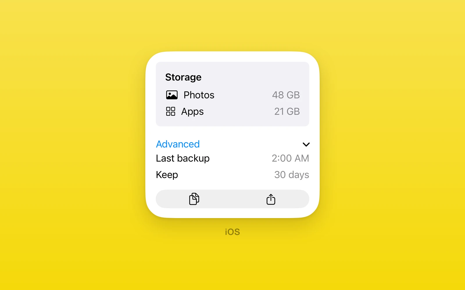
One.iOS grouping, disclosure, glass, and modifier slot views are SwiftUI’s
own: Group, GroupBox, ViewThatFits, GeometryReader, TimelineView, Canvas, ControlGroup,
DisclosureGroup, Divider, Link, LabeledContent, Glass,
GlassEffectContainer, Overlay, ViewSlot, and SwipeActions. They group
related rows and controls, adapt to available space, and attach native content
such as overlays, insets, and swipe actions to a view.
Reach for GroupBox and DisclosureGroup for settings cards, ControlGroup
for segmented controls, Glass for Liquid Glass surfaces on iOS 26 and
later, and ViewSlot when a SwiftUI modifier slot needs native content. Every
view here throws on web and Android.
Usage
import { useState } from 'react'import { One } from 'one'
export function AdvancedSettings() {  const [open, setOpen] = useState(false)  const [debug, setDebug] = useState(false)
  return (    <One.iOS.DisclosureGroup      label="Advanced"      isExpanded={open}      onIsExpandedChange={setOpen}    >      <One.iOS.Toggle label="Debug" isOn={debug} onIsOnChange={setDebug} />    </One.iOS.DisclosureGroup>  )}
The group expands natively and reports its height as content opens and closes, so following siblings move with it. The expansion is controlled: the native tap proposes, and the state update accepts.
How it works
Group views compose into the parent’s hosting controller like any container,
measuring their SwiftUI content and reporting the height back. Controls inside
them stay interactive: taps in an overlay, a slot, or a swipe action reach
React handlers. DisclosureGroup is the only controlled one, with an
expansion flag, change callback, and revision like any controlled value.
Slots and markers follow strict rules checked in JavaScript. Overlay takes
at most one Overlay.Content, ViewSlot takes exactly one
ViewSlot.Content, and SwipeActions takes at most one Actions group per
edge. Unknown slot names and slots newer than the device iOS throw, as do
children that are not SwiftUI views.
Group
Group groups children with no visual effect. Use it to apply modifiers or
structure to several views at once.
import { One } from 'one'
function Pair() { return ( <One.iOS.Group> <One.iOS.Text text="First" /> <One.iOS.Text text="Second" /> </One.iOS.Group> )}| Props | Type | Description |
|---|---|---|
swiftStyleOneNativeStyleSwiftUI modifiers for this view, such as padding, background, and frame. | OneNativeStyle | SwiftUI modifiers for this view, such as padding, background, and frame. |
children (required)ReactNodeThe grouped views. | ReactNode | The grouped views. |
GroupBox
GroupBox draws SwiftUI’s standard group box around its native children.
label is optional; omit it for the unlabeled SwiftUI initializer. The box
measures its content and stretches to its parent’s width.
import { One } from 'one'
function Account() { return ( <One.iOS.GroupBox label="Account"> <One.iOS.Text text="Signed in" /> </One.iOS.GroupBox> )}| Props | Type | Description |
|---|---|---|
labelstringThe title. Omit it for an unlabeled box. | string | The title. Omit it for an unlabeled box. |
swiftStyleOneNativeStyleSwiftUI modifiers for this view, such as padding, background, and frame. | OneNativeStyle | SwiftUI modifiers for this view, such as padding, background, and frame. |
childrenReactNodeThe boxed content. | ReactNode | The boxed content. |
ViewThatFits
ViewThatFits shows SwiftUI’s first child that fits the proposed size. It
needs iOS 16 or newer. Children stay in preference order; axes controls
which dimensions SwiftUI tests, and when none fits SwiftUI shows the last
child. Give the view a style.height when vertical fit should use a finite
height proposal: without it the container measures its chosen child and the
vertical proposal is unbounded.
import { One } from 'one'
function AdaptiveAction({ run }: { run: () => void }) { return ( <One.iOS.ViewThatFits axes="horizontal"> <One.iOS.Button label="Detailed action" onPress={run} /> <One.iOS.Button label="Action" onPress={run} /> </One.iOS.ViewThatFits> )}| Props | Type | Description |
|---|---|---|
axesViewThatFitsAxes = "both"horizontal, vertical, or both: the dimensions tested for fit. | ViewThatFitsAxes = "both" | horizontal, vertical, or both: the dimensions tested for fit. |
swiftStyleOneNativeStyleSwiftUI modifiers for this view, such as padding, background, and frame. | OneNativeStyle | SwiftUI modifiers for this view, such as padding, background, and frame. |
children (required)ReactNodeCandidates, most preferred first. | ReactNode | Candidates, most preferred first. |
GeometryReader
GeometryReader adapts SwiftUI’s content builder to a JavaScript function
receiving a GeometryProxy. The native reader mounts first; the builder runs
after SwiftUI reports real geometry and runs again when that geometry
changes. No placeholder geometry is delivered. Its returned content composes
natively. Give the reader an explicit size or flex: 1, because it fills the
box it is offered. A non-function child throws.
import { One } from 'one'
function Measured() {  return (    <One.iOS.GeometryReader style={{ height: 100 }}>      {(geometry) => <One.iOS.Text text={`wide ${Math.round(geometry.size.width)}`} />}    </One.iOS.GeometryReader>  )}
size and safeAreaInsets come from the native geometry proxy.
frame('global') and frame('local') adapt SwiftUI’s frame(in:); frames
and size are reported separately, so a transformed global frame does not
replace the reader’s layout size. Named coordinate spaces throw instead of
returning an unrelated frame. A reader in a scroll view can update while
scrolling, so keep the builder cheap and observe it from an effect when
updating React state outside its native content.
| Props | Type | Description |
|---|---|---|
swiftStyleOneNativeStyleSwiftUI modifiers for this view, such as padding, background, and frame. | OneNativeStyle | SwiftUI modifiers for this view, such as padding, background, and frame. |
children (required)(geometry: GeometryProxy) => ReactNodeThe content closure, run with the native geometry snapshot. | (geometry: GeometryProxy) => ReactNode | The content closure, run with the native geometry snapshot. |
| GeometryProxy | Type | Description |
|---|---|---|
sizeGeometryProxySizeThe reader size: { width, height }. | GeometryProxySize | The reader size: { width, height }. |
safeAreaInsetsGeometryProxySafeAreaInsetsThe safe-area insets: { top, leading, bottom, trailing }. | GeometryProxySafeAreaInsets | The safe-area insets: { top, leading, bottom, trailing }. |
frame(coordinateSpace: 'global' | 'local') => GeometryProxyFrameSwiftUI frame(in:), using a global or local coordinate-space argument. | (coordinateSpace: 'global' | 'local') => GeometryProxyFrame | SwiftUI frame(in:), using a global or local coordinate-space argument. |
TimelineView
TimelineView re-runs its content as time passes. Native owns the schedule, so
SwiftUI decides when each entry is due; every entry’s date and cadence
reach your function, which returns the content for that moment. Reach for it
for clocks, countdowns, and anything that should refresh on a clock instead of
on state. Nothing renders until the first entry, which arrives as the view
appears, and the view sizes to its content. A non-function child throws.
import { One } from 'one'
function Clock() {  return (    <One.iOS.TimelineView schedule="everyMinute">      {({ date }) => (        <One.iOS.Text text={date.toLocaleTimeString([], { timeStyle: 'short' })} />      )}    </One.iOS.TimelineView>  )}
schedule takes 'everyMinute', { type: 'periodic', from, by } with by in
seconds, or { type: 'explicit', dates }. These are SwiftUI’s .everyMinute,
.periodic(from:by:) and .explicit(_:). The animation schedule is not bound.
SwiftUI ends an explicit timeline at its last date, so the content runs for each
date but the last.
cadence is 'live', 'seconds', or 'minutes': how often SwiftUI expects to
refresh. SwiftUI lowers it when fast updates are not needed, so a clock can
leave out its seconds when the cadence is 'minutes'.
| Props | Type | Description |
|---|---|---|
schedule (required)TimelineSchedule'everyMinute', { type: 'periodic', from: Date, by: number }, or { type: 'explicit', dates: Date[] }. | TimelineSchedule | 'everyMinute', { type: 'periodic', from: Date, by: number }, or { type: 'explicit', dates: Date[] }. |
swiftStyleOneNativeStyleSwiftUI modifiers for this view, such as padding, background, and frame. | OneNativeStyle | SwiftUI modifiers for this view, such as padding, background, and frame. |
children (required)(context: TimelineViewContext) => ReactNodeThe content closure, run with the date and cadence of each entry. | (context: TimelineViewContext) => ReactNode | The content closure, run with the date and cadence of each entry. |
| TimelineViewContext | Type | Description |
|---|---|---|
dateDateThe date of the entry the content is drawn for. | Date | The date of the entry the content is drawn for. |
cadenceTimelineCadenceHow often SwiftUI expects to refresh the content: 'live', 'seconds', or 'minutes'. | TimelineCadence | How often SwiftUI expects to refresh the content: 'live', 'seconds', or 'minutes'. |
Canvas
Canvas is SwiftUI’s immediate-mode 2D drawing view. Its function child gets
(context, size) and draws with the same calls as SwiftUI’s GraphicsContext:
fill, stroke, draw, clip, translateBy, scaleBy, rotate, opacity,
blendMode, and drawLayer. Reach for it for charts, gauges, sparklines and
anything custom that would be too many views. The canvas fills the box it is
given, as SwiftUI’s does, so give it a height with style; inside a SwiftUI
container such as TimelineView, give it one with swiftStyle={{ height }}.
React runs your function and records each call; native then replays the calls on
the real GraphicsContext. Nothing is drawn until native has laid the canvas out
and reported its size, so the first frame is blank. The function runs again when
the size or the state it reads changes. Put a canvas in a TimelineView to
animate it.
import { One } from 'one'
const { Canvas, Path, Shading } = One.iOS
function Ring({ progress }: { progress: number }) {  return (    <Canvas style={{ height: 120 }}>      {(context, size) => {        const center = { x: size.width / 2, y: size.height / 2 }        const arc = new Path()        arc.addArc(center, 40, One.iOS.Angle.degrees(-90), One.iOS.Angle.degrees(-90 + 360 * progress), false)        context.stroke(arc, Shading.color('#3E63DD'), { lineWidth: 8, lineCap: 'round' })        context.draw({ text: `${Math.round(progress * 100)}%`, fontSize: 20, fontWeight: 'bold' }, { at: center })      }}    </Canvas>  )}
Path is a value builder that mirrors SwiftUI’s Path: move, addLine,
addQuadCurve, addCurve, addArc, addRect, addRoundedRect, addEllipse,
and closeSubpath, with Path.rect, Path.ellipse and Path.roundedRect for
the common shapes. Angle.degrees and Angle.radians make angles. Shading
takes color, linearGradient and radialGradient, built from a Gradient of
colors or color stops. draw takes text { text, fontSize, fontWeight, color }
or an SF Symbol { systemName, color }, placed { at, anchor } or { in } a
rectangle. stroke takes a line width or { lineWidth, lineCap, lineJoin, miterLimit, dash, dashPhase }, and fill and clip take { eoFill, antialiased }.
Anything SwiftUI would reject throws: a path call that needs a current point
before there is one, a negative line width, an opacity outside 0 to 1, a
non-finite number, an unknown blend mode or a color that does not parse. Images
are not bound yet. Standalone Shape views are a separate view; Path is
shared with them.
| Props | Type | Description |
|---|---|---|
opaqueboolean = falseTells SwiftUI the canvas draws every pixel, so it can skip blending. | boolean = false | Tells SwiftUI the canvas draws every pixel, so it can skip blending. |
colorModeCanvasColorMode = 'nonLinear'The color space the canvas draws in: 'nonLinear', 'linear', or 'extendedLinear'. | CanvasColorMode = 'nonLinear' | The color space the canvas draws in: 'nonLinear', 'linear', or 'extendedLinear'. |
rendersAsynchronouslyboolean = falseLets SwiftUI draw the canvas off the main thread. | boolean = false | Lets SwiftUI draw the canvas off the main thread. |
swiftStyleOneNativeStyleSwiftUI modifiers for this view, such as padding, background, and frame. | OneNativeStyle | SwiftUI modifiers for this view, such as padding, background, and frame. |
children (required)(context: GraphicsContext, size: CanvasSize) => voidThe renderer, run with the context and the canvas size. | (context: GraphicsContext, size: CanvasSize) => void | The renderer, run with the context and the canvas size. |
ControlGroup
ControlGroup groups controls into one segmented unit with an optional
label and systemImage. The style name is checked against the device’s iOS
version.
import { One } from 'one'
function Zoom({ zoomIn, zoomOut }: { zoomIn: () => void; zoomOut: () => void }) { return ( <One.iOS.ControlGroup label="Zoom" controlGroupStyle="palette"> <One.iOS.Button label="In" onPress={zoomIn} /> <One.iOS.Button label="Out" onPress={zoomOut} /> </One.iOS.ControlGroup> )}| Props | Type | Description |
|---|---|---|
labelstring = ""The group title. | string = "" | The group title. |
systemImageSFSymbolName | "" = ""An SF Symbol for the title. | SFSymbolName | "" = "" | An SF Symbol for the title. |
controlGroupStyleControlGroupStyle = "automatic"automatic, palette, navigation, menu, or compactMenu. | ControlGroupStyle = "automatic" | automatic, palette, navigation, menu, or compactMenu. |
swiftStyleOneNativeStyleSwiftUI modifiers for this view, such as padding, background, and frame. | OneNativeStyle | SwiftUI modifiers for this view, such as padding, background, and frame. |
children (required)ReactNodeThe controls. | ReactNode | The controls. |
DisclosureGroup
DisclosureGroup is an expanding section. label is a required non-empty
string; isExpanded with onIsExpandedChange, and revision for external
resets, controls the expansion.
import { useState } from 'react'import { One } from 'one'
function Advanced() {  const [open, setOpen] = useState(false)  const [debug, setDebug] = useState(false)
return ( <One.iOS.DisclosureGroup label="Advanced" isExpanded={open} onIsExpandedChange={setOpen}> <One.iOS.Toggle label="Debug" isOn={debug} onIsOnChange={setDebug} /> </One.iOS.DisclosureGroup> )}| Props | Type | Description |
|---|---|---|
label (required)stringThe row title. | string | The row title. |
isExpanded (required)booleanWhether the content shows. | boolean | Whether the content shows. |
onIsExpandedChange (required)(isExpanded: boolean) => voidA native tap, with the new state. | (isExpanded: boolean) => void | A native tap, with the new state. |
revisionnumber = 0Increase with a new isExpanded to reset it from outside. | number = 0 | Increase with a new isExpanded to reset it from outside. |
swiftStyleOneNativeStyleSwiftUI modifiers for this view, such as padding, background, and frame. | OneNativeStyle | SwiftUI modifiers for this view, such as padding, background, and frame. |
children (required)ReactNodeThe content shown when expanded. | ReactNode | The content shown when expanded. |
Divider
Divider draws a hairline between rows. It takes view props and swiftStyle,
holds no content, and must be inside a native container.
import { One } from 'one'
function Split() {  return (    <One.iOS.VStack>      <One.iOS.Text text="Above" />      <One.iOS.Divider />      <One.iOS.Text text="Below" />    </One.iOS.VStack>  )}
Link
Link opens destination with an optional label or children. The
destination must be a non-empty, parseable URL string, and the link needs a
label or children.
import { One } from 'one'
function Docs() { return <One.iOS.Link destination="https://onestack.dev" label="Docs" />}| Props | Type | Description |
|---|---|---|
destination (required)stringThe URL to open. | string | The URL to open. |
labelstringThe link text. | string | The link text. |
swiftStyleOneNativeStyleSwiftUI modifiers for this view, such as padding, background, and frame. | OneNativeStyle | SwiftUI modifiers for this view, such as padding, background, and frame. |
childrenReactNodeCustom content in place of label. | ReactNode | Custom content in place of label. |
LabeledContent
LabeledContent shows a label with a value string, an optional
systemImage, and optional children for a custom value view. Pass either
value or children, and at least one: both or neither throws.
import { One } from 'one'
function Storage() { return <One.iOS.LabeledContent label="Storage" value="42 GB free" systemImage="star" />}| Props | Type | Description |
|---|---|---|
label (required)stringThe row title. | string | The row title. |
valuestringThe trailing value. | string | The trailing value. |
systemImageSFSymbolName | ""An SF Symbol before the title. | SFSymbolName | "" | An SF Symbol before the title. |
swiftStyleOneNativeStyleSwiftUI modifiers for this view, such as padding, background, and frame. | OneNativeStyle | SwiftUI modifiers for this view, such as padding, background, and frame. |
childrenReactNodeA custom value view in place of value. | ReactNode | A custom value view in place of value. |
Glass
Glass applies a glass or material effect to its children. Give a standalone
Glass a height or a flex parent: the surface fills the box it receives.
Glass effects need iOS 26 or newer; identity removes the glass while keeping
the children. cornerRadius needs shape="roundedRectangle", and an unset
glass effect defaults to regular unless a material is given.
import { One } from 'one'
function GlassCard() { return ( <One.iOS.Glass glassEffect="regular" shape="roundedRectangle" cornerRadius={16}> <One.iOS.Text text="Now playing" /> </One.iOS.Glass> )}| Props | Type | Description |
|---|---|---|
glassEffectGlassEffectregular, clear, or identity. | GlassEffect | regular, clear, or identity. |
materialMaterialultraThin, thin, regular, thick, or ultraThick. | Material | ultraThin, thin, regular, thick, or ultraThick. |
shapeGlassEffectShapecapsule, circle, containerRelativeShape, ellipse, rectangle, or roundedRectangle. | GlassEffectShape | capsule, circle, containerRelativeShape, ellipse, rectangle, or roundedRectangle. |
cornerRadiusnumberRounds the shape explicitly. | number | Rounds the shape explicitly. |
interactiveboolean = falseReacts to touches. | boolean = false | Reacts to touches. |
tintColorValueTints the glass. | ColorValue | Tints the glass. |
colorSchemeColorSchemelight or dark for the effect. | ColorScheme | light or dark for the effect. |
swiftStyleOneNativeStyleSwiftUI modifiers for this view, such as padding, background, and frame. | OneNativeStyle | SwiftUI modifiers for this view, such as padding, background, and frame. |
children (required)ReactNodeThe content on the glass. | ReactNode | The content on the glass. |
GlassEffectContainer
GlassEffectContainer groups nearby SwiftUI glass effects so the system can
merge them. It needs iOS 26 or newer. spacing is an optional finite number
in points; omit it to keep SwiftUI’s own default spacing.
import { One } from 'one'
function GlassBar({ add, filter }: { add: () => void; filter: () => void }) { return ( <One.iOS.GlassEffectContainer spacing={12}> <One.iOS.HStack spacing={8}> <One.iOS.Button label="Add" onPress={add} swiftStyle={{ glassEffect: 'regular' }} /> <One.iOS.Button label="Filter" onPress={filter} swiftStyle={{ glassEffect: 'regular' }} /> </One.iOS.HStack> </One.iOS.GlassEffectContainer> )}| Props | Type | Description |
|---|---|---|
spacingnumberHow close glass shapes must be to merge. | number | How close glass shapes must be to merge. |
swiftStyleOneNativeStyleSwiftUI modifiers for this view, such as padding, background, and frame. | OneNativeStyle | SwiftUI modifiers for this view, such as padding, background, and frame. |
children (required)ReactNodeViews with glass effects. | ReactNode | Views with glass effects. |
Overlay, Overlay.Content
Overlay layers its children over the views behind it with an alignment
from the ZStack alignments. Overlay.Content marks the overlay subtree; the
overlay takes at most one. Native controls in that subtree can call their
React handlers. Alignment uses the base view’s SwiftUI frame: for a full-size
bottomTrailing overlay, give the base a native
swiftStyle.frameWithWidthAndHeightAndAlignment frame, since a React Native
style on the outer host alone does not enlarge an intrinsic Text base.
import { One } from 'one'
function Badged({ open }: { open: () => void }) { return ( <One.iOS.Overlay alignment="topTrailing"> <One.iOS.Label label="Inbox" systemImage="tray" /> <One.iOS.Overlay.Content> <One.iOS.Button label="3" onPress={open} /> </One.iOS.Overlay.Content> </One.iOS.Overlay> )}| Props | Type | Description |
|---|---|---|
alignmentZStackAlignmentWhere the overlay sits on the base view. | ZStackAlignment | Where the overlay sits on the base view. |
children (required)ReactNodeThe base view and one Overlay.Content. | ReactNode | The base view and one Overlay.Content. |
| Overlay.Content | Type | Description |
|---|---|---|
children (required)ReactNodeThe overlay subtree. | ReactNode | The overlay subtree. |
ViewSlot, ViewSlot.Content
ViewSlot hosts a native view modifier slot: name picks the SwiftUI slot
(background, mask, alert, list row background, safe-area insets and bars,
accessibility, and the rest) and options carries that slot’s parameters.
ViewSlot.Content marks the slot subtree, exactly one per slot. Unknown names
and slots newer than the device iOS throw. The slot content can contain
interactive native controls. Like a ZStack, a standalone ViewSlot or Overlay reports the height SwiftUI measured to React Native.
import { One } from 'one'
function PinnedAction({ continueFlow }: { continueFlow: () => void }) {  return (    <One.iOS.ViewSlot name="safeAreaInsetWithVerticalEdge" options={{ edge: 'bottom' }}>      <One.iOS.Text text="Content" />      <One.iOS.ViewSlot.Content>        <One.iOS.Button label="Continue" onPress={continueFlow} />      </One.iOS.ViewSlot.Content>    </One.iOS.ViewSlot>  )}
For a side inset, use name="safeAreaInsetWithHorizontalEdge" with
options={{ edge: 'leading' }} or options={{ edge: 'trailing' }}. On iOS
26 or newer, safeAreaBarWithVerticalEdge accepts options={{ edge: 'top' }}
or options={{ edge: 'bottom' }}, and safeAreaBarWithHorizontalEdge accepts
options={{ edge: 'leading' }} or options={{ edge: 'trailing' }}. Put the
bar’s native controls in ViewSlot.Content.
Slots also expose supported optional SwiftUI arguments. For example,
safeAreaInsetWithVerticalEdge accepts
options={{ edge: 'bottom', alignment: 'trailing', spacing: 0 }}. Omitting
alignment or spacing keeps SwiftUI’s defaults; spacing: 0 explicitly
removes the gap. The generated options type lists the arguments for each slot.
SwipeActions, SwipeActions.Actions
SwipeActions wraps a List row to add swipe actions.
SwipeActions.Actions groups the action buttons with edge ('leading' or
'trailing') and allowsFullSwipe. At most one Actions group per edge; a
full swipe runs the first action unless allowsFullSwipe is false.
import { One } from 'one'
function MessageRow({ pinMessage, archiveMessage }: { pinMessage: () => void; archiveMessage: () => void }) { return ( <One.iOS.List> <One.iOS.SwipeActions> <One.iOS.Text text="Message" /> <One.iOS.SwipeActions.Actions edge="leading" allowsFullSwipe={false}> <One.iOS.Button label="Pin" onPress={pinMessage} /> </One.iOS.SwipeActions.Actions> <One.iOS.SwipeActions.Actions edge="trailing"> <One.iOS.Button label="Archive" onPress={archiveMessage} /> </One.iOS.SwipeActions.Actions> </One.iOS.SwipeActions> </One.iOS.List> )}| SwipeActions | Type | Description |
|---|---|---|
children (required)ReactNodeThe row and its Actions groups. | ReactNode | The row and its Actions groups. |
| SwipeActions.Actions | Type | Description |
|---|---|---|
edgeSwipeActionsEdge = "trailing"leading or trailing. | SwipeActionsEdge = "trailing" | leading or trailing. |
allowsFullSwipeboolean = trueA full swipe runs the first action. | boolean = true | A full swipe runs the first action. |
children (required)ReactNodeThe action buttons. | ReactNode | The action buttons. |
Platform differences
| iOS | Android | Web | |
|---|---|---|---|
| Renders | SwiftUI groups | Throws | Throws |
| Glass | iOS 26 up | None | None |
| Slots | Native slots | None | None |
Limits and gotchas
- Slots take one content marker.
Overlaytakes at most oneOverlay.Content,ViewSlotexactly oneViewSlot.Content, andSwipeActionsat most oneActionsgroup per edge. Dividerneeds a container. Rendering one outside a native container throws, as does giving it children.- Links and labeled rows need content. A
Linkneeds a label or children plus a parseable URL;LabeledContentneeds exactly one ofvalueand children. - New views gate on iOS.
ViewThatFitsneeds iOS 16, glass views iOS 26, and every slot name is checked against the device version.
Edit this page on GitHub.