
iOS Pickers
SwiftUI Picker, DatePicker, MultiDatePicker, ColorPicker, PhotosPicker, and FileImporter under One.iOS
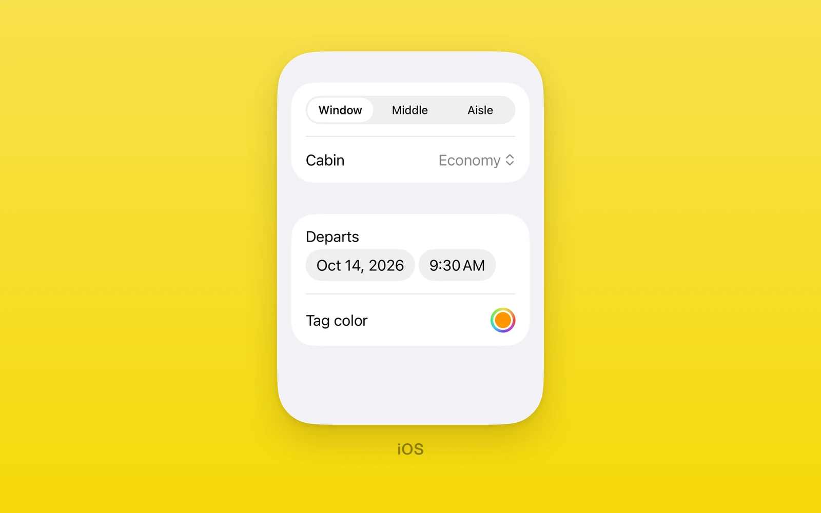
One.iOS value pickers and system choosers are SwiftUI’s own: Picker,
DatePicker, MultiDatePicker, and ColorPicker for controlled values, and
PhotosPicker and FileImporter for the system photo library and file
browser. The value pickers take a selection, a change callback, and a
revision for resets from the outside; invalid values throw during render.
Reach for these when iOS should present its own chooser: a segmented option row, a calendar date, a color well, the photo library, or the document browser. Every picker here throws on web and Android.
Usage
import { useState } from 'react'import { One } from 'one'
export function TripForm() {  const [seat, setSeat] = useState('window')  const [date, setDate] = useState(() => new Date())
  return (    <One.iOS.Form style={{ flex: 1 }}>      <One.iOS.Section>        <One.iOS.Picker          label="Seat"          selection={seat}          onSelectionChange={setSeat}          swiftStyle={{ pickerStyle: 'segmented' }}        >          <One.iOS.Text text="Window" swiftStyle={{ tag: 'window' }} />          <One.iOS.Text text="Aisle" swiftStyle={{ tag: 'aisle' }} />        </One.iOS.Picker>        <One.iOS.DatePicker          label="Departure"          selection={date}          onSelectionChange={setDate}          in={[new Date(), new Date(4001, 0, 1)]}        />      </One.iOS.Section>    </One.iOS.Form>  )}
Each pick reports its value and the state update moves the picker to match. To
reset a selection from outside, set the new value and increase revision in
the same render.
Every picker also accepts accessibilityLabel, accessibilityHint,
accessibilityValue, testID, style, onLayout, and swiftStyle.
How it works
Value pickers keep their selection in a native model with an event count and a
revision. A native pick bumps the count and reports the new value; JavaScript
calls the change handler and acknowledges the event. Raising revision with a
new selection resets the picker from the outside. Option tags, bounds, and
formats are validated in JavaScript before anything reaches native, so a bad
value throws during render with a JavaScript stack.
Dates cross the bridge as timestamps. DatePicker keeps full precision, while
MultiDatePicker reduces each date to day components in the device calendar,
so same-day duplicates collapse into one date and the time of day does not
survive the round trip. Styles use SwiftUI names checked against the device’s
iOS version.
Picker
Picker picks one string from its option children. Each option is a Text
view whose swiftStyle.tag is its value, as in SwiftUI’s Picker
content builder. Tags must be unique and the selection must match one tag.
Options must be direct Text children; Text nested in Fragments or custom
wrapper components is rejected, so map option data to Text directly.
import { useState } from 'react'import { One } from 'one'
function SeatPicker() {  const [seat, setSeat] = useState('window')
return ( <One.iOS.Picker label="Seat" selection={seat} onSelectionChange={setSeat} swiftStyle={{ pickerStyle: 'segmented', maxWidth: Infinity }} > <One.iOS.Text text="Window" swiftStyle={{ tag: 'window' }} /> <One.iOS.Text text="Aisle" swiftStyle={{ tag: 'aisle' }} /> </One.iOS.Picker> )}| Props | Type | Description |
|---|---|---|
selection (required)stringThe selected option tag. | string | The selected option tag. |
onSelectionChange (required)(value: string) => voidA native pick, with the new value. | (value: string) => void | A native pick, with the new value. |
revisionnumber = 0Increase with a new selection to reset it from outside. | number = 0 | Increase with a new selection to reset it from outside. |
labelstring = ""The row title. | string = "" | The row title. |
pickerStyle and disabled are SwiftUI modifiers set through swiftStyle.
pickerStyle is automatic, menu, segmented, inline, wheel, palette,
tabs, or navigationLink.
Outside a Form, a segmented picker keeps its natural width. Pass
swiftStyle={{ pickerStyle: 'segmented', maxWidth: Infinity }} to fill the row,
which is SwiftUI’s .frame(maxWidth: .infinity). Inside a Form row it fills on
its own.
DatePicker
DatePicker picks a Date. The selection must lie within in, and the
lower bound must not be after the upper bound, or the picker throws. An
unset in defaults to the start of year 1 through the start of year 4001.
import { useState } from 'react'import { One } from 'one'
function Departure() {  const [date, setDate] = useState(() => new Date())
return ( <One.iOS.DatePicker label="Departure" selection={date} onSelectionChange={setDate} in={[new Date(), new Date(4001, 0, 1)]} displayedComponents="date" swiftStyle={{ datePickerStyle: 'compact' }} /> )}| Props | Type | Description |
|---|---|---|
selection (required)DateThe selected date. | Date | The selected date. |
onSelectionChange (required)(value: Date) => voidA native pick, with the new date. | (value: Date) => void | A native pick, with the new date. |
revisionnumber = 0Increase with a new selection to reset it from outside. | number = 0 | Increase with a new selection to reset it from outside. |
labelstring = ""The row title. | string = "" | The row title. |
inreadonly [Date, Date]The allowed range as [lower, upper]. Year 1 through 4001 when unset. | readonly [Date, Date] | The allowed range as [lower, upper]. Year 1 through 4001 when unset. |
displayedComponents"date" | "hourAndMinute" | "dateAndTime" = "dateAndTime"Which parts people pick. | "date" | "hourAndMinute" | "dateAndTime" = "dateAndTime" | Which parts people pick. |
datePickerStyle and disabled are SwiftUI modifiers set through
swiftStyle. datePickerStyle is automatic, compact, graphical, or
wheel.
MultiDatePicker
MultiDatePicker picks any number of days. The selection is day-precision in
the device calendar: same-day duplicates collapse into one date, and the time
of day does not survive the round trip.
import { useState } from 'react'import { One } from 'one'
function TripDays() {  const [days, setDays] = useState<Date[]>([new Date(2026, 9, 12)])
return ( <One.iOS.MultiDatePicker label="Trip days" selection={days} onSelectionChange={(picked) => setDays([...picked])} in={[new Date(2026, 9, 1), new Date(2026, 9, 31)]} /> )}| Props | Type | Description |
|---|---|---|
selection (required)readonly Date[]The selected days. | readonly Date[] | The selected days. |
onSelectionChange (required)(value: readonly Date[]) => voidA native pick, with the new days. | (value: readonly Date[]) => void | A native pick, with the new days. |
revisionnumber = 0Increase with a new selection to reset it from outside. | number = 0 | Increase with a new selection to reset it from outside. |
labelstring = ""The row title. | string = "" | The row title. |
inreadonly [Date, Date]The allowed range as [lower, upper]. Year 1 through 4001 when unset. | readonly [Date, Date] | The allowed range as [lower, upper]. Year 1 through 4001 when unset. |
disabled is a SwiftUI modifier set through swiftStyle.
Every date must be valid and lie within in, and the lower bound must not
be after the upper bound, or the picker throws.
ColorPicker
ColorPicker picks a color as a hex string: #RRGGBB or #RRGGBBAA.
Anything else throws during render.
import { useState } from 'react'import { One } from 'one'
function Accent() {  const [color, setColor] = useState('#0066CC')
return ( <One.iOS.ColorPicker label="Accent" selection={color} onSelectionChange={setColor} supportsOpacity={false} /> )}| Props | Type | Description |
|---|---|---|
selection (required)string#RRGGBB or #RRGGBBAA. Anything else throws. | string | #RRGGBB or #RRGGBBAA. Anything else throws. |
onSelectionChange (required)(value: string) => voidA native pick, with the new color. | (value: string) => void | A native pick, with the new color. |
revisionnumber = 0Increase with a new selection to reset it from outside. | number = 0 | Increase with a new selection to reset it from outside. |
labelstring = ""The row title. | string = "" | The row title. |
supportsOpacityboolean = trueShows the opacity slider. | boolean = true | Shows the opacity slider. |
disabled is a SwiftUI modifier set through swiftStyle.
PhotosPicker
PhotosPicker is a button that opens the system photo library. label is
required at runtime; an empty label throws.
import { useState } from 'react'import { One } from 'one'
function PhotoPicker({ addPhoto }: { addPhoto: (url: string) => void }) {  const [error, setError] = useState('')
  return (    <>      <One.iOS.PhotosPicker        label="Add photos"        onPick={(url) => addPhoto(url)}        onPickError={(message) => setError(message)}        maxSelectionCount={5}        filter="images"      />      <One.iOS.Text text={error} />    </>  )}
onPick fires once per picked asset with a local file URL, its index, and the
total count; onPickItemIdentifier reports the same asset’s Photos identifier
instead.
| Props | Type | Description |
|---|---|---|
labelstringThe button title. Required at runtime; an empty label throws. | string | The button title. Required at runtime; an empty label throws. |
systemImageSFSymbolName | "" = ""An SF Symbol shown with the title. | SFSymbolName | "" = "" | An SF Symbol shown with the title. |
onPick(url: string, index: number, count: number) => voidOnce per picked asset, with a local file URL. | (url: string, index: number, count: number) => void | Once per picked asset, with a local file URL. |
onPickItemIdentifier(itemIdentifier: string, index: number, count: number) => voidOnce per picked asset, with its Photos identifier. | (itemIdentifier: string, index: number, count: number) => void | Once per picked asset, with its Photos identifier. |
onPickError(message: string) => voidAn asset failed to load. | (message: string) => void | An asset failed to load. |
maxSelectionCountnumber = 1How many assets people may pick. | number = 1 | How many assets people may pick. |
selectionBehaviorPhotosPickerSelectionBehavior = "default"default, ordered, continuous, or continuousAndOrdered. | PhotosPickerSelectionBehavior = "default" | default, ordered, continuous, or continuousAndOrdered. |
filter"any" | "images" | "videos" | "livePhotos" | "screenshots" | "screenRecordings" | "slomoVideos" | "timelapseVideos" | "cinematicVideos" | "depthEffectPhotos" | "bursts" | "panoramas" = "any"Which assets the library shows. | "any" | "images" | "videos" | "livePhotos" | "screenshots" | "screenRecordings" | "slomoVideos" | "timelapseVideos" | "cinematicVideos" | "depthEffectPhotos" | "bursts" | "panoramas" = "any" | Which assets the library shows. |
preferredItemEncodingEncodingDisambiguationPolicy = "automatic"automatic, current, or compatible file encoding. | EncodingDisambiguationPolicy = "automatic" | automatic, current, or compatible file encoding. |
disabled is a SwiftUI modifier set through swiftStyle.
FileImporter
FileImporter presents the system file browser while isPresented is true.
import { useState } from 'react'import { One } from 'one'
function ImportFile({ openFile }: { openFile: (url: string) => void }) {  const [presented, setPresented] = useState(false)
  return (    <>      <One.iOS.Button label="Import" onPress={() => setPresented(true)} />      <One.iOS.FileImporter        isPresented={presented}        onIsPresentedChange={setPresented}        allowedContentTypes={['public.plain-text']}        onCompletion={(completion) => {          if (completion.type === 'success') openFile(completion.url)        }}      />    </>  )}
A completion is { type: 'success', url, index, count },
{ type: 'failed', message }, or { type: 'cancelled' }. With multiple
selection, onCompletion fires once per file.
| Props | Type | Description |
|---|---|---|
isPresented (required)booleanWhether the browser is shown. | boolean | Whether the browser is shown. |
onIsPresentedChange (required)(value: boolean) => voidThe browser closed. | (value: boolean) => void | The browser closed. |
revisionnumberIncrease with a new isPresented to reset it from outside. | number | Increase with a new isPresented to reset it from outside. |
onCompletion(completion: FileImporterCompletion) => voidOnce per file, or once on failure or cancel. | (completion: FileImporterCompletion) => void | Once per file, or once on failure or cancel. |
allowedContentTypesreadonly string[]Uniform type identifiers people may pick. | readonly string[] | Uniform type identifiers people may pick. |
allowsMultipleSelectionbooleanAllows more than one file. | boolean | Allows more than one file. |
Platform differences
| iOS | Android | Web | |
|---|---|---|---|
| Renders | SwiftUI pickers | Throws | Throws |
| Choosers | System sheets | None | None |
| Dates | Device calendar | None | None |
Limits and gotchas
- Invalid values throw at render. Option tags, date bounds, and the color hex format are checked in JavaScript before anything reaches native.
navigationLinkstyle needs a NavigationStack. Its choices push onto the enclosing stack.- Multi-date picks lose the time. The selection reduces to day components in the device calendar, collapsing same-day duplicates.
- The photo button needs a label. An empty
PhotosPickerlabel throws.
Edit this page on GitHub.