iOS Media and Empty States
Image, AsyncImage, shapes, VideoPlayer, LivePhotoView, WebView, PhotosPicker, Map, ContentUnavailableView, and EmptyView under One.iOS
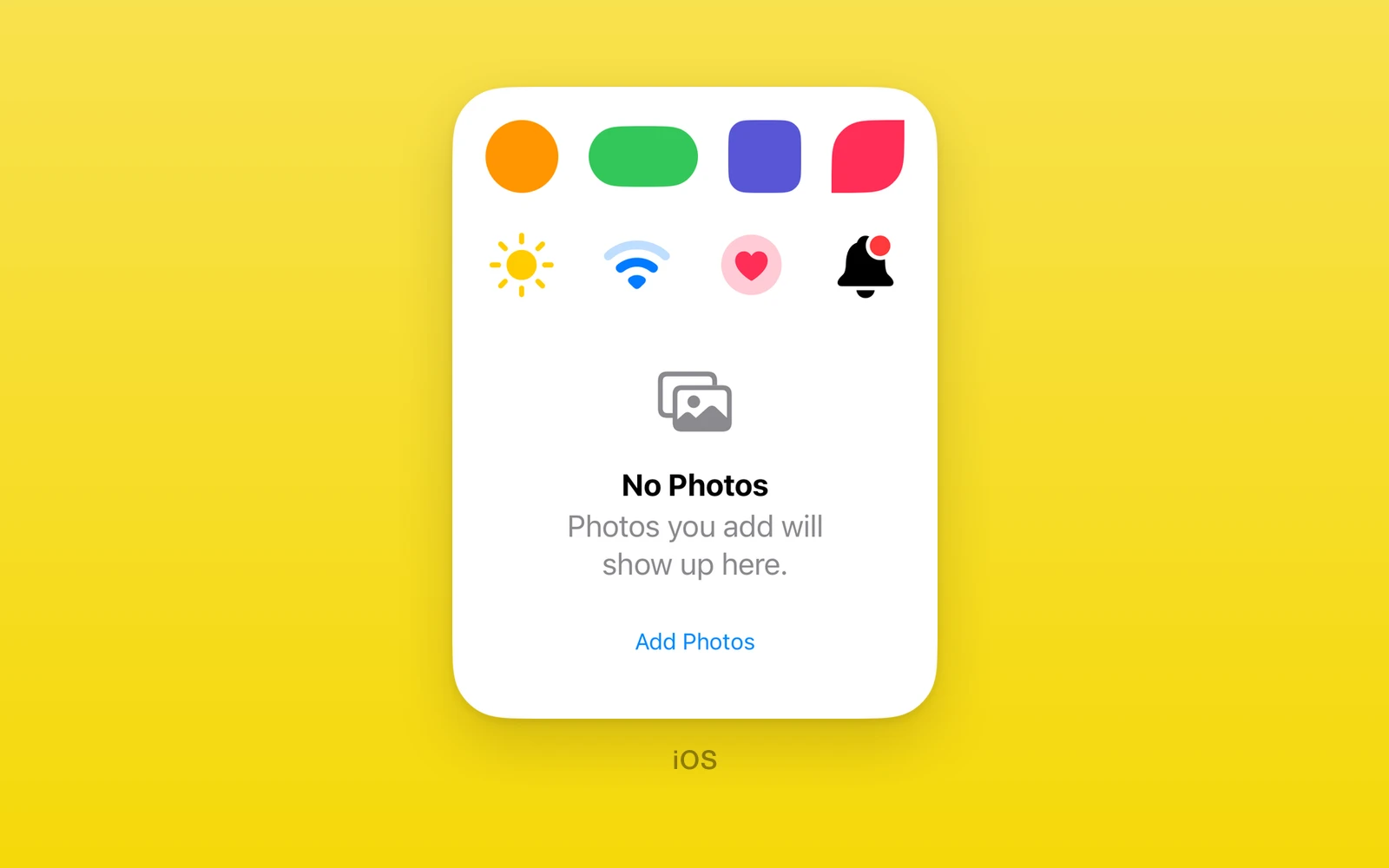
Media, shapes, and empty states under One.iOS, drawn by SwiftUI.
Imagedraws an SF Symbol, or a remote image that toolbars can tint.- Shapes fill the box React Native gives them.
VideoPlayer,LivePhotoView, andWebViewplay and show content.ContentUnavailableViewandEmptyViewfill the gaps.- Every view here throws on web and Android. Keep them in an iOS branch or an
.ios.tsxfile.
Every view also accepts accessibilityLabel, accessibilityHint,
accessibilityValue, testID, style, onLayout, and swiftStyle.
Image
One.iOS.Image draws an SF Symbol by name, or a remote image from uri.
import { One } from 'one'
<One.iOS.Image systemName="cloud.sun.rain.fill" symbolRenderingMode="multicolor" imageScale="large" /><One.iOS.Image systemName="wifi" variableValue={0.5} />| Props | Type | Description |
|---|---|---|
systemNameSFSymbolName | "" = ""The SF Symbol to draw. | SFSymbolName | "" = "" | The SF Symbol to draw. |
uristring = ""A remote image to draw in place of a symbol. It fills its frame. | string = "" | A remote image to draw in place of a symbol. It fills its frame. |
renderingMode"original" | "template" = "original"template lets a toolbar tint a remote image. | "original" | "template" = "original" | template lets a toolbar tint a remote image. |
symbolRenderingModeSymbolRenderingMode | "" = ""monochrome, multicolor, hierarchical, or palette. | SymbolRenderingMode | "" = "" | monochrome, multicolor, hierarchical, or palette. |
symbolVariantSymbolVariants | "" = ""none, circle, square, rectangle, fill, or slash. | SymbolVariants | "" = "" | none, circle, square, rectangle, fill, or slash. |
imageScaleImageScale | "" = ""small, medium, or large. | ImageScale | "" = "" | small, medium, or large. |
variableValuenumberFrom 0 to 1, for symbols that fill in steps. | number | From 0 to 1, for symbols that fill in steps. |
colorRoleIconColorRole | "" = ""A system color role, as in One.UI.Icon. | IconColorRole | "" = "" | A system color role, as in One.UI.Icon. |
resizableboolean = falseScales a symbol to its frame instead of its point size. | boolean = false | Scales a symbol to its frame instead of its point size. |
"" leaves a modifier unset. Size a symbol with swiftStyle={{ fontSize }}
and give the view a matching width and height, or React Native lays it out
smaller than the glyph and neighbors overlap it.
For bundled, remote, and cross-platform images, use One.UI.Image instead.
AsyncImage
One.iOS.AsyncImage is SwiftUI’s AsyncImage. It shows a placeholder while
it loads the image at url, then draws the image at its own size. Pass url=""
to use the SDK nil URL and keep its default placeholder.
<One.iOS.AsyncImage url="https://reactnative.dev/img/tiny_logo.png" scale={2} />| Props | Type | Description |
|---|---|---|
url (required)stringThe image URL. "" shows only the placeholder. | string | The image URL. "" shows only the placeholder. |
scalenumber = 1Image pixels per point. | number = 1 | Image pixels per point. |
This binding exposes init(url:scale:). The SDK also has image-content,
placeholder and AsyncImagePhase builders, and iOS 27 request initializers.
Those overloads are not bound: their callbacks return generic SwiftUI view
values or take URLRequest, which this generated constructor bridge cannot
carry. There is no phase-observer replacement.
Shapes
Circle, Capsule, Rectangle, Ellipse, RoundedRectangle,
UnevenRoundedRectangle, and ConcentricRectangle fill a SwiftUI shape with
fill, a color value. Every shape except ConcentricRectangle also takes
strokeBorder, a color drawn inside its edge over the fill, lineWidth points
wide. A shape fills the box React Native gives it.
| RoundedRectangle | Type | Description |
|---|---|---|
fillColorValueThe fill color. Every shape takes it. | ColorValue | The fill color. Every shape takes it. |
strokeBorderColorValueA border color drawn inside the edge. | ColorValue | A border color drawn inside the edge. |
lineWidthnumber = 1The border width in points. | number = 1 | The border width in points. |
cornerRadiusnumber = 0The corner radius in points. | number = 0 | The corner radius in points. |
| UnevenRoundedRectangle | Type | Description |
|---|---|---|
fillColorValueThe fill color. | ColorValue | The fill color. |
strokeBorderColorValueA border color drawn inside the edge. | ColorValue | A border color drawn inside the edge. |
lineWidthnumber = 1The border width in points. | number = 1 | The border width in points. |
topLeadingRadiusnumber = 0The top leading corner. | number = 0 | The top leading corner. |
bottomLeadingRadiusnumber = 0The bottom leading corner. | number = 0 | The bottom leading corner. |
bottomTrailingRadiusnumber = 0The bottom trailing corner. | number = 0 | The bottom trailing corner. |
topTrailingRadiusnumber = 0The top trailing corner. | number = 0 | The top trailing corner. |
ConcentricRectangle needs iOS 26 and takes its corners from the enclosing
container shape. With none, its corners can be square.
import { One } from 'one'
<One.iOS.Circle fill="red" /><One.iOS.Ellipse fill="blue" /><One.iOS.RoundedRectangle fill="blue" cornerRadius={12} /><One.iOS.Capsule fill="white" strokeBorder="gray" lineWidth={2} /><One.iOS.UnevenRoundedRectangle fill="green" topLeadingRadius={16} bottomTrailingRadius={16} /><One.iOS.ConcentricRectangle fill="orange" style={{ width: 120, height: 80 }} />
VideoPlayer
One.iOS.VideoPlayer plays a local file:// or remote video from url with
AVKit’s native transport controls. autoplay starts playback when a URL loads.
The player keeps its position when other props change and creates a new player
only when url changes.
import { One } from 'one'
<One.iOS.VideoPlayer url="https://example.com/trailer.mp4" autoplay />| Props | Type | Description |
|---|---|---|
urlstring = ""A file:// or remote video. A new url makes a new player. | string = "" | A file:// or remote video. A new url makes a new player. |
autoplayboolean = falsePlays once the video loads. | boolean = false | Plays once the video loads. |
command"play" | "pause" | "seek" | "" = ""A command to run. See below. | "play" | "pause" | "seek" | "" = "" | A command to run. See below. |
commandRevisionnumber = 0Increase to run command again. | number = 0 | Increase to run command again. |
seekToMsnumber = 0Where a seek goes, in milliseconds. | number = 0 | Where a seek goes, in milliseconds. |
onPlaybackStatus(state: string, positionMs: number, durationMs: number) => voidloading, playing, paused, ended, or failed, with the time. | (state: string, positionMs: number, durationMs: number) => void | loading, playing, paused, ended, or failed, with the time. |
Set command to play, pause, or seek and increment commandRevision for
each command, including repeated commands of the same kind. For seek, pass a
nonnegative seekToMs. Revisions start at 1 and increase for the lifetime of
the view. onPlaybackStatus(state, positionMs, durationMs) reports loading,
playing, paused, ended, or failed and the player’s current time and
duration in milliseconds. Unknown or indefinite duration is reported as 0.
Status arrives on state changes, after commands, and about twice per second
while playing. Native transport taps also change the reported status.
import { useState } from 'react'import { Button, View } from 'react-native'import { One } from 'one'
function ControlledVideo() {  const [control, setControl] = useState({ command: '' as '' | 'play' | 'pause' | 'seek', revision: 0, seekToMs: 0 })  const send = (command: 'play' | 'pause' | 'seek', seekToMs = 0) =>    setControl((previous) => ({ command, seekToMs, revision: previous.revision + 1 }))
  return <View>    <One.iOS.VideoPlayer      url="https://example.com/trailer.mp4"      style={{ height: 220 }}      command={control.command}      commandRevision={control.revision}      seekToMs={control.seekToMs}      onPlaybackStatus={(state, positionMs, durationMs) => console.log(state, positionMs, durationMs)}    />    <Button title="Play" onPress={() => send('play')} />    <Button title="Pause" onPress={() => send('pause')} />    <Button title="Skip to 10s" onPress={() => send('seek', 10_000)} />  </View>}
The player follows the app’s audio session. This view does not publish Now
Playing metadata or remote transport callbacks. One.Audio manages a
separate player and its own remote commands. Playback during backgrounding,
cross-app audio arbitration, and picture in picture need device proof.
LivePhotoView
One.iOS.LivePhotoView displays and plays a Live Photo already in the Photos
library. Request read access with One.PhotoLibrary.requestReadPermission(),
then pass the identifier of an asset whose isLivePhoto is true. Give the
view an explicit size. It loads a nondegraded PHLivePhoto and shows its key
photo at ready. It does not capture or assemble a still and video pair.
| Props | Type | Description |
|---|---|---|
assetIdentifier (required)stringThe Photos local identifier of a Live Photo. | string | The Photos local identifier of a Live Photo. |
autoplayboolean = falsePlays once the Live Photo is ready. | boolean = false | Plays once the Live Photo is ready. |
command"play" | "stop" | "" = ""A command to run. | "play" | "stop" | "" = "" | A command to run. |
commandRevisionnumber = 0Increase to run command again. | number = 0 | Increase to run command again. |
onPlaybackState(state: string, errorCode: string) => voidloading, ready, playing, ended, or failed. | (state: string, errorCode: string) => void | loading, ready, playing, ended, or failed. |
import { useState } from 'react'import { Button, View } from 'react-native'import { One } from 'one'
function LivePhoto({ assetIdentifier }: { assetIdentifier: string }) {  const [control, setControl] = useState({ command: '' as '' | 'play' | 'stop', revision: 0 })  const send = (command: 'play' | 'stop') =>    setControl((previous) => ({ command, revision: previous.revision + 1 }))
  return <View>    <One.iOS.LivePhotoView      assetIdentifier={assetIdentifier}      style={{ width: 320, height: 240 }}      command={control.command}      commandRevision={control.revision}      onPlaybackState={(state, errorCode) => console.log(state, errorCode)}    />    <Button title="Play" onPress={() => send('play')} />    <Button title="Stop" onPress={() => send('stop')} />  </View>}
autoplay starts when the nondegraded Live Photo reaches ready. Otherwise,
send play or stop with an increasing positive commandRevision. Revisions
increase for the lifetime of the view, including repeated commands. The event
order for a normal full play is loading, ready, playing, ended.
stop returns to ready and shows the key photo. onPlaybackState receives
(state, errorCode); errorCode is '' unless state is failed.
Failures report E_LIVE_PHOTO_INPUT for a blank identifier supplied directly
to the native component, E_LIVE_PHOTO_PERMISSION without Photos read access,
E_LIVE_PHOTO_NOT_FOUND for an unknown or inaccessible asset,
E_LIVE_PHOTO_NOT_LIVE for an ordinary image, or E_LIVE_PHOTO_LOAD if Photos
cannot supply the Live Photo. The JavaScript wrapper rejects a blank identifier
before mounting. The loader uses local Photos data and does not download an
iCloud original; a cloud-only asset may fail with E_LIVE_PHOTO_LOAD.
WebView
One.iOS.WebView embeds web content from url or an html string.
| Props | Type | Description |
|---|---|---|
urlstring = ""The page to load. | string = "" | The page to load. |
htmlstring = ""Markup to load in place of a url. | string = "" | Markup to load in place of a url. |
scriptstring = ""JavaScript to insert at document start. | string = "" | JavaScript to insert at document start. |
command"reload" | "goBack" | "goForward" | "evaluate" | "postMessage" | "" = ""A command to run. See below. | "reload" | "goBack" | "goForward" | "evaluate" | "postMessage" | "" = "" | A command to run. See below. |
commandRevisionnumber = 0Increase to run command again. | number = 0 | Increase to run command again. |
commandValuestring = ""The script or message for evaluate and postMessage. | string = "" | The script or message for evaluate and postMessage. |
limitsNavigationsToAppBoundDomainsboolean = falseOnly allow app-bound domains. | boolean = false | Only allow app-bound domains. |
inlineMediaboolean = falsePlay page media inline. | boolean = false | Play page media inline. |
inspectableboolean = falseExpose the page to Safari devtools. | boolean = false | Expose the page to Safari devtools. |
bouncesboolean = trueRubber-band past the content edge. | boolean = true | Rubber-band past the content edge. |
onNavigate(url: string) => voidThe page URL changed. | (url: string) => void | The page URL changed. |
onTitleChange(title: string) => voidThe page title changed. | (title: string) => void | The page title changed. |
onLoadingChange(loading: boolean, progress: number) => voidLoading started, progressed, or ended. | (loading: boolean, progress: number) => void | Loading started, progressed, or ended. |
onLoadStart() => voidA navigation started. | () => void | A navigation started. |
onLoadEnd() => voidA navigation finished. | () => void | A navigation finished. |
onError(message: string) => voidA load failed. | (message: string) => void | A load failed. |
onHttpError(statusCode: number) => voidA response carried an HTTP error status. | (statusCode: number) => void | A response carried an HTTP error status. |
onMessage(data: string) => voidThe page posted a bridge message. | (data: string) => void | The page posted a bridge message. |
onHistoryChange(canGoBack: boolean, canGoForward: boolean) => voidBack-forward availability changed. | (canGoBack: boolean, canGoForward: boolean) => void | Back-forward availability changed. |
onProcessTerminate() => voidThe web content process ended. | () => void | The web content process ended. |
backForwardNavigationGesturesBackForwardNavigationGesturesBehavior | "" = ""Edge swipes to go back and forward. | BackForwardNavigationGesturesBehavior | "" = "" | Edge swipes to go back and forward. |
magnificationGesturesMagnificationGesturesBehavior | "" = ""Pinch to zoom. | MagnificationGesturesBehavior | "" = "" | Pinch to zoom. |
linkPreviewsLinkPreviewBehavior | "" = ""Long press link previews. | LinkPreviewBehavior | "" = "" | Long press link previews. |
elementFullscreenElementFullscreenBehavior | "" = ""Lets page video go full screen. | ElementFullscreenBehavior | "" = "" | Lets page video go full screen. |
contentBackgroundVisibility | "" = ""The web view background. | Visibility | "" = "" | The web view background. |
The gesture and behavior props take automatic, enabled, or disabled, and
"" leaves them unset. Use html for markup already in the app. Updating that string loads the new
document and reports its title through onTitleChange; give the view an
explicit height because WebView fills its React Native box.
Set command to reload, goBack, goForward, evaluate, or postMessage
and increment commandRevision for each command, including repeated commands
of the same kind. evaluate runs commandValue as JavaScript; postMessage
dispatches a message event whose data is commandValue. The page calls
window.ReactNativeWebView.postMessage to reach onMessage. script runs at
document start but rebuilds the page when it changes, so it is for fixed page
setup rather than repeated calls.
PhotosPicker
One.iOS.PhotosPicker is documented with the other pickers in
iOS Pickers.
Map
One.iOS.Map is the SwiftUI map.
| Props | Type | Description |
|---|---|---|
latitudenumber = 37.7749The region center. | number = 37.7749 | The region center. |
longitudenumber = -122.4194The region center. | number = -122.4194 | The region center. |
distancenumber = 5000How far the camera sits from the center, in meters. | number = 5000 | How far the camera sits from the center, in meters. |
markers (required)readonly MapMarker[]Pins, each { id, label, latitude, longitude }. | readonly MapMarker[] | Pins, each { id, label, latitude, longitude }. |
onRegionChange(latitude: number, longitude: number, distance: number) => voidThe region when a move ends. | (latitude: number, longitude: number, distance: number) => void | The region when a move ends. |
For a cross-platform map with polylines, polygons, and circles, use One.UI.Map instead.
Map controls
One.iOS.MapCompass, One.iOS.MapPitchToggle, and
One.iOS.MapUserLocationButton are the MapKit controls. Nest them under
One.iOS.Map and they render in the map’s own controls, operating on the
owning map. Any other child throws instead of mounting.
import { One } from 'one'
<One.iOS.Map markers={pins} style={{ flex: 1 }}> <One.iOS.MapCompass /> <One.iOS.MapPitchToggle /></One.iOS.Map>| Map children | Type | Description |
|---|---|---|
childrenReactNodeMap controls: MapCompass, MapPitchToggle, MapUserLocationButton. | ReactNode | Map controls: MapCompass, MapPitchToggle, MapUserLocationButton. |
ContentUnavailableView
One.iOS.ContentUnavailableView renders an empty state with action
buttons. Give it a height or flex: 1; it fills the area React Native assigns. A
React state update after an action can change the view or replace it.
import { One } from 'one'
<One.iOS.ContentUnavailableView title="No results" systemImage="magnifyingglass" description="Try a different search." actions={[{ id: 'retry', label: 'Retry' }]} onAction={(id) => id === 'retry' && reload()}/>| Props | Type | Description |
|---|---|---|
titlestring = ""The headline. | string = "" | The headline. |
systemImageSFSymbolName | "" = ""An SF Symbol above the title. | SFSymbolName | "" = "" | An SF Symbol above the title. |
descriptionstring = ""Text under the title. | string = "" | Text under the title. |
actions (required)readonly DialogAction[]Buttons, each { id, label, role }. | readonly DialogAction[] | Buttons, each { id, label, role }. |
onAction(id: string) => voidA tapped action. | (id: string) => void | A tapped action. |
EmptyView
One.iOS.EmptyView renders nothing. It is a placeholder where SwiftUI
expects a view, with no props beyond the shared view props.
Inside a SwiftUI HStack, it adds no visible element or extra spacing.
It has zero visible height. In a React Native container with gap, the gaps
on either side still apply to its position in the child list.
On web and Android these views throw. Keep them behind a platform check.
Edit this page on GitHub.