
iOS Progress and Gauges
SwiftUI ProgressView and Gauge under One.iOS
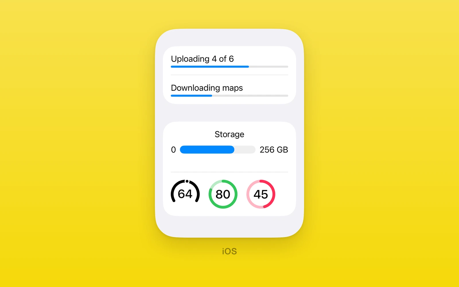
One.iOS progress and measurement views are SwiftUI’s own: ProgressView
shows a determinate bar or an indeterminate spinner, and Gauge shows a value
in a range with optional labels. Both take plain numbers, validated at render:
out-of-range values throw.
Reach for ProgressView for work with a known or unknown total, and Gauge
for a measurement against fixed bounds such as speed. Both throw on web and
Android.
Usage
import { One } from 'one'
function Download({ downloaded, size }: { downloaded: number; size: number }) {  return (    <>      <One.iOS.ProgressView label="Download" value={downloaded} total={size} />      <One.iOS.ProgressView label="Loading" />    </>  )}
A set value draws a determinate bar; an unset one draws a spinner.
Both also accept accessibilityLabel, accessibilityHint,
accessibilityValue, testID, style, onLayout, and swiftStyle.
How it works
Progress and gauge state is plain props, not controlled values: there is no
native editing, so no revision or change callback. The wrappers validate the
numbers before they reach native, then the SwiftUI view draws them.
progressViewStyle and gaugeStyle are SwiftUI modifiers set through
swiftStyle, and their names are checked against the device’s iOS version.
ProgressView
ProgressView shows determinate progress when value is set and a spinner
when it is not. value must be finite and lie between 0 and total, and
total must be finite and above zero, or the view throws.
import { One } from 'one'
function Sync({ done, total }: { done: number; total: number }) { return ( <One.iOS.ProgressView label="Sync" value={done} total={total} swiftStyle={{ progressViewStyle: 'linear' }} /> )}| Props | Type | Description |
|---|---|---|
valuenumberWork done. Leave it unset for a spinner. | number | Work done. Leave it unset for a spinner. |
totalnumber = 1Work in all. Must be above zero. | number = 1 | Work in all. Must be above zero. |
labelstring = ""Text shown with the bar. | string = "" | Text shown with the bar. |
progressViewStyle and disabled are SwiftUI modifiers set through
swiftStyle. progressViewStyle is automatic, linear, or circular.
Gauge
Gauge shows value within in. Every number must be finite, the lower
bound must be below the upper bound, and the value must lie within the
range, or the gauge throws.
import { One } from 'one'
function Speed({ speed }: { speed: number }) { return ( <One.iOS.Gauge label="Speed" value={speed} in={[0, 120]} currentValueLabel={`${speed}`} swiftStyle={{ gaugeStyle: 'accessoryCircular' }} /> )}| Props | Type | Description |
|---|---|---|
valuenumber = 0The current value. | number = 0 | The current value. |
inreadonly [number, number] = [0, 1]The allowed range as [lower, upper]. | readonly [number, number] = [0, 1] | The allowed range as [lower, upper]. |
labelstring = ""What the gauge measures. | string = "" | What the gauge measures. |
currentValueLabelstring = ""Text for the current value. | string = "" | Text for the current value. |
minimumValueLabelstring = ""Text at the low end. | string = "" | Text at the low end. |
maximumValueLabelstring = ""Text at the high end. | string = "" | Text at the high end. |
gaugeStyle and disabled are SwiftUI modifiers set through swiftStyle.
gaugeStyle is automatic, linearCapacity, accessoryLinear,
accessoryLinearCapacity, accessoryCircular, or accessoryCircularCapacity.
Platform differences
| iOS | Android | Web | |
|---|---|---|---|
| Renders | SwiftUI views | Throws | Throws |
| Styles | Native styles | None | None |
Limits and gotchas
- Ranges are checked at render. A value outside its bounds, a total at or below zero, or an inverted gauge range throws.
- Progress is one way. These views take numbers and report nothing back; there is no change callback or revision.
Edit this page on GitHub.