
iOS Buttons and Toggles
SwiftUI buttons, toggles, sliders, and system action buttons under One.iOS
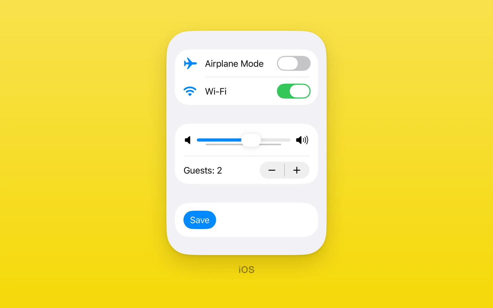
One.iOS pressable and value controls are SwiftUI’s own: Button, Toggle,
Slider, Stepper, and the system buttons PasteButton, ShareLink,
SignInWithAppleButton, PayWithApplePayButton, AddPassToWalletButton,
EditButton, RenameButton, LocationButton, and ShortcutsLink. The value
controls are controlled, with a value, a change callback, and a revision for
resets from the outside; the system buttons wrap Apple flows such as sign in,
share, and paste.
Reach for these when a control should look and behave like the system one, from
a form switch to an Apple Pay button. Keep them in an iOS branch or an
.ios.tsx file: every control here throws on web and Android.
Usage
import { useState } from 'react'import { One } from 'one'
export function SoundSettings({ save }: { save: () => void }) {  const [muted, setMuted] = useState(false)  const [volume, setVolume] = useState(50)
  return (    <One.iOS.Form style={{ flex: 1 }}>      <One.iOS.Section title="Sound">        <One.iOS.Toggle label="Mute" isOn={muted} onIsOnChange={setMuted} />        <One.iOS.Slider          label="Volume"          value={volume}          onValueChange={setVolume}          minimumValueImage="speaker.fill"          maximumValueImage="speaker.wave.3.fill"        />        <One.iOS.Button label="Save" systemImage="checkmark" onPress={save} />      </One.iOS.Section>    </One.iOS.Form>  )}
The toggle and slider are controlled by React state; each native edit reports
its value and the state update moves the control to match. To reset a
controlled value from outside, set the new value and increase revision in the
same render.
Every control on this page also accepts accessibilityLabel,
accessibilityHint, accessibilityValue, testID, style, onLayout, and
swiftStyle. Set swiftStyle={{ disabled: true }} to dim a control and block
its input. Styles such as buttonStyle and toggleStyle are SwiftUI modifiers
set the same way.
How it works
Value controls keep their state in a native model with an event count and a
revision. A flip, drag, or step bumps the count and reports the new value;
JavaScript calls the change handler and acknowledges the event. A NativeState
handle binds by id, so every bound view converges on the same value without a
React render, and writes through the handle stay silent. Raising revision
with a new value resets the control from the outside.
Buttons report taps and take no value. Styles, set through swiftStyle, and
roles use SwiftUI names, checked against the device’s iOS version, and symbols
use SF Symbol names.
The system buttons render Apple’s own controls with their system artwork and
behavior: the paste button pastes strings, the share link opens the share
sheet, and the location button carries CoreLocation’s one-time authorization.
Button
Button runs onPress when tapped. It takes either a label or children,
never both, and needs at least a label, a systemImage, or children.
import { One } from 'one'
function SaveButton({ save }: { save: () => void }) { return ( <One.iOS.Button label="Save" systemImage="checkmark" swiftStyle={{ buttonStyle: 'borderedProminent' }} onPress={save} /> )}| Props | Type | Description |
|---|---|---|
onPress() => voidRuns when tapped. | () => void | Runs when tapped. |
labelstring = ""The title. | string = "" | The title. |
systemImageSFSymbolName | "" = ""An SF Symbol shown with the title. | SFSymbolName | "" = "" | An SF Symbol shown with the title. |
buttonRoleButtonRole | "" = ""destructive, cancel, confirm, or close. | ButtonRole | "" = "" | destructive, cancel, confirm, or close. |
childrenReactNodeCustom content in place of label and systemImage. | ReactNode | Custom content in place of label and systemImage. |
buttonStyle and disabled are SwiftUI modifiers set through swiftStyle.
buttonStyle is automatic, glass, glassProminent, borderless, plain,
bordered, or borderedProminent. Use swiftStyle={{ controlSize: 'extraLarge' }}
to apply SwiftUI’s .controlSize(_:) to a standalone button.
Toggle
Toggle is a labeled switch.
import { One, useNativeState } from 'one'
function MuteSwitch() {  const muted = useNativeState(false)
return ( <One.iOS.Toggle label="Mute" isOn={muted} onIsOnChange={(value) => muted.set(value)} /> )}| Props | Type | Description |
|---|---|---|
isOn (required)boolean | NativeState<boolean>Whether the switch is on, or a useNativeState handle. | boolean | NativeState<boolean> | Whether the switch is on, or a useNativeState handle. |
onIsOnChange (required)(value: boolean) => voidA native flip, with the new value. | (value: boolean) => void | A native flip, with the new value. |
revisionnumber = 0Increase with a new isOn to reset it from outside. | number = 0 | Increase with a new isOn to reset it from outside. |
labelstringThe text before the switch. | string | The text before the switch. |
systemImageSFSymbolName | ""An SF Symbol before the label. | SFSymbolName | "" | An SF Symbol before the label. |
toggleStyle and disabled are SwiftUI modifiers set through swiftStyle.
toggleStyle is automatic, switch, or button.
Slider
Slider picks a number in a range. The value must lie within the range, the
minimum must be below the maximum, every number must be finite, and the step
must be above zero, or the slider throws during render.
import { useState } from 'react'import { One } from 'one'
function Volume() {  const [volume, setVolume] = useState(50)
return ( <One.iOS.Slider label="Volume" value={volume} onValueChange={setVolume} in={[0, 100]} step={5} minimumValueImage="speaker.fill" maximumValueImage="speaker.wave.3.fill" /> )}| Props | Type | Description |
|---|---|---|
value (required)number | NativeState<number>The current value, or a native state handle that withAnimation can animate. | number | NativeState<number> | The current value, or a native state handle that withAnimation can animate. |
onValueChange (required)(value: number) => voidA native drag, with the new value. | (value: number) => void | A native drag, with the new value. |
revisionnumber = 0Increase with a new value to reset it from outside. | number = 0 | Increase with a new value to reset it from outside. |
labelstringRead by VoiceOver. A form row does not draw it. | string | Read by VoiceOver. A form row does not draw it. |
inreadonly [number, number] = [0, 100]The allowed range as [lower, upper]. | readonly [number, number] = [0, 100] | The allowed range as [lower, upper]. |
stepnumber = 1The increment between values. | number = 1 | The increment between values. |
minimumValueLabelstringText at the low end. | string | Text at the low end. |
maximumValueLabelstringText at the high end. | string | Text at the high end. |
minimumValueImagestringAn SF Symbol at the low end. | string | An SF Symbol at the low end. |
maximumValueImagestringAn SF Symbol at the high end. | string | An SF Symbol at the high end. |
disabled is a SwiftUI modifier set through swiftStyle.
Stepper
Stepper steps a number up and down. It throws on the same invalid ranges as
Slider.
import { useState } from 'react'import { One } from 'one'
function PartySize() {  const [size, setSize] = useState(2)
return ( <One.iOS.Stepper label="Guests" value={size} onValueChange={setSize} in={[1, 12]} /> )}| Props | Type | Description |
|---|---|---|
value (required)number | NativeState<number>The current value, or a native state handle that withAnimation can animate. | number | NativeState<number> | The current value, or a native state handle that withAnimation can animate. |
onValueChange (required)(value: number) => voidA native step, with the new value. | (value: number) => void | A native step, with the new value. |
revisionnumber = 0Increase with a new value to reset it from outside. | number = 0 | Increase with a new value to reset it from outside. |
labelstringThe text before the buttons. | string | The text before the buttons. |
inreadonly [number, number] = [0, 100]The allowed range as [lower, upper]. | readonly [number, number] = [0, 100] | The allowed range as [lower, upper]. |
stepnumber = 1The amount each tap adds or removes. | number = 1 | The amount each tap adds or removes. |
disabled is a SwiftUI modifier set through swiftStyle.
PasteButton
PasteButton renders SwiftUI’s system Paste button for strings. SwiftUI
performs the paste without the usual pasteboard prompt. It carries the system
label, so label and systemImage are not props.
import { useState } from 'react'import { One } from 'one'
function PasteField() {  const [text, setText] = useState('')
return ( <> <One.iOS.PasteButton onPaste={(values) => setText(values.join('\n'))} /> <One.iOS.Text text={text} /> </> )}| Props | Type | Description |
|---|---|---|
onPaste(values: readonly string[]) => voidEvery string from one paste. | (values: readonly string[]) => void | Every string from one paste. |
disabled is a SwiftUI modifier set through swiftStyle.
ShareLink
ShareLink opens the system share sheet for one item. It does not report
completion.
import { One } from 'one'
function ShareSite() {  return <One.iOS.ShareLink label="Share" item="https://onestack.dev" itemType="url" />}
Changing item and itemType changes what the next share sheet receives.
| Props | Type | Description |
|---|---|---|
labelstringThe button title. | string | The button title. |
systemImageSFSymbolName | ""An SF Symbol shown with the title. | SFSymbolName | "" | An SF Symbol shown with the title. |
itemstringThe text or URL to share. | string | The text or URL to share. |
itemType"text" | "url"How iOS receives the item. A URL gets a link preview. | "text" | "url" | How iOS receives the item. A URL gets a link preview. |
subjectstringA subject, for activities such as Mail. | string | A subject, for activities such as Mail. |
messagestringText shared with the item. | string | Text shared with the item. |
disabled is a SwiftUI modifier set through swiftStyle.
SignInWithAppleButton
SignInWithAppleButton starts the Apple sign in flow.
import { useState } from 'react'import { One } from 'one'
function AppleSignIn({ signedIn }: { signedIn: (user: string) => void }) {  const [error, setError] = useState('')
  return (    <>      <One.iOS.SignInWithAppleButton        label="signIn"        requestedScopes={['email']}        onCompletion={(completion) => {          if (completion.type === 'success') signedIn(completion.user)          else if (completion.type === 'failed') setError(completion.message)        }}      />      <One.iOS.Text text={error} />    </>  )}
A completion is { type: 'success', user, email, givenName, familyName, identityToken, authorizationCode }, { type: 'failed', message }, or
{ type: 'cancelled' }.
| Props | Type | Description |
|---|---|---|
onCompletion(completion: SignInWithAppleButtonCompletion) => voidThe result: success, failed, or cancelled. | (completion: SignInWithAppleButtonCompletion) => void | The result: success, failed, or cancelled. |
requestedScopesreadonly ("fullName" | "email")[]The user details to request. | readonly ("fullName" | "email")[] | The user details to request. |
noncestringA replay protection nonce passed through to Apple. | string | A replay protection nonce passed through to Apple. |
label"signIn" | "continue" | "signUp"The system button title. | "signIn" | "continue" | "signUp" | The system button title. |
PayWithApplePayButton
PayWithApplePayButton shows the system Apple Pay button and runs onPress
on tap. label picks the artwork’s verb and the payWithApplePayButtonStyle
modifier in swiftStyle picks its color. The button only reports the tap:
presenting the payment sheet takes native code.
import { One } from 'one'
function CheckoutButton({ startCheckout }: { startCheckout: () => void }) { return ( <One.iOS.PayWithApplePayButton label="buy" swiftStyle={{ payWithApplePayButtonStyle: 'black' }} onPress={startCheckout} /> )}| Props | Type | Description |
|---|---|---|
onPress() => voidRuns on tap. | () => void | Runs on tap. |
labelPayWithApplePayButtonLabel = "plain"plain, buy, addMoney, book, checkout, continue, contribute, donate, inStore, order, reload, rent, setUp, subscribe, support, tip, or topUp. | PayWithApplePayButtonLabel = "plain" | plain, buy, addMoney, book, checkout, continue, contribute, donate, inStore, order, reload, rent, setUp, subscribe, support, tip, or topUp. |
payWithApplePayButtonStyle and disabled are SwiftUI modifiers set through
swiftStyle. The style is white, whiteOutline, black, or automatic.
AddPassToWalletButton
AddPassToWalletButton shows the system add-to-wallet button and runs
onPress on tap. The artwork has no label variant, only the two black styles, set with the
addPassToWalletButtonStyle modifier in swiftStyle.
Adding the pass itself takes native code.
import { One } from 'one'
function WalletButton({ addPass }: { addPass: () => void }) { return ( <One.iOS.AddPassToWalletButton swiftStyle={{ addPassToWalletButtonStyle: 'blackOutline' }} onPress={addPass} /> )}| Props | Type | Description |
|---|---|---|
onPress() => voidRuns on tap. | () => void | Runs on tap. |
addPassToWalletButtonStyle and disabled are SwiftUI modifiers set through
swiftStyle. The style is black or blackOutline.
EditButton
EditButton is SwiftUI’s edit button, with only the shared props. Put it
inside a native List; its label changes from Edit to Done and back
when tapped.
import { One } from 'one'
function EditableList() {  return (    <One.iOS.List>      <One.iOS.Section title="Items">        <One.iOS.EditButton />        <One.iOS.Text text="Alpha" />        <One.iOS.Text text="Beta" />      </One.iOS.Section>    </One.iOS.List>  )}
List does not expose SwiftUI row deletion or moves yet, so the button only
switches its own label.
RenameButton
RenameButton is SwiftUI’s rename button, with only the shared props. It runs
the rename action its view provides: pass a callback as
swiftStyle={{ renameAction }}. Without one it does nothing.
import { useState } from 'react'import { One } from 'one'
function Renamable() {  const [editingTitle, setEditingTitle] = useState(false)
  return (    <>      <One.iOS.RenameButton swiftStyle={{ renameAction: () => setEditingTitle(true) }} />      <One.iOS.Text text={editingTitle ? 'Editing' : 'Idle'} />    </>  )}
LocationButton
LocationButton is CoreLocation’s location button. A tap grants one-time
location authorization without a permission prompt, then runs onAction. Read
the position with Location inside onAction.
import { One } from 'one'
function LocateMe({ locate }: { locate: () => void }) { return <One.iOS.LocationButton title="currentLocation" onAction={locate} />}| Props | Type | Description |
|---|---|---|
onAction() => voidRuns after the tap grants authorization. | () => void | Runs after the tap grants authorization. |
title"currentLocation" | "sendCurrentLocation" | "sendMyCurrentLocation" | "shareCurrentLocation" | "shareMyCurrentLocation" | "" = "currentLocation"The system label. "" shows only the location arrow. | "currentLocation" | "sendCurrentLocation" | "sendMyCurrentLocation" | "shareCurrentLocation" | "shareMyCurrentLocation" | "" = "currentLocation" | The system label. "" shows only the location arrow. |
ShortcutsLink
ShortcutsLink opens this app’s page in the Shortcuts app, where people find
the shortcuts its App Intents provide. onAction runs after the tap launches
Shortcuts.
import { useState } from 'react'import { One } from 'one'
function AppShortcuts() {  const [launched, setLaunched] = useState(false)
return ( <> <One.iOS.ShortcutsLink onAction={() => setLaunched(true)} /> {launched ? <One.iOS.Text text="Opened Shortcuts" /> : null} </> )}| Props | Type | Description |
|---|---|---|
onAction() => voidRuns after the tap launches Shortcuts. | () => void | Runs after the tap launches Shortcuts. |
Platform differences
| iOS | Android | Web | |
|---|---|---|---|
| Renders | SwiftUI controls | Throws | Throws |
| Values | Native models | None | None |
| System flows | Apple sheets | None | None |
Limits and gotchas
- Controlled values reset with a revision bump. A new value alone loses to
an unacknowledged native edit; increase
revisionin the same render to reset the control from the outside. - Ranges are checked at render. Slider and Stepper throw unless every number is finite, the minimum is below the maximum, the step is above zero, and the value sits inside the range.
- A button takes a label or children, never both. Children with a label or system image throw, as does a button with none of label, system image, or children.
- Pay and wallet buttons only report the tap. The payment sheet and the pass itself need native code beyond these views.
Edit this page on GitHub.