wwwwwwwwwwwwwwwwwww
Icons
Shared icon selection with responsive native colors
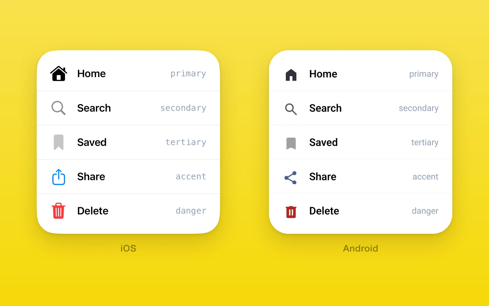
One.UI.Icon picks the icon element your app provides for the current
platform and colors it with a native system color.
- iOS draws an SF Symbol through
One.iOS.Image. - Android draws a Material Symbol through
One.Android.Icon. - Color roles follow light and dark mode without a React subscription.
- Your app owns the glyphs, sizes, and accessibility labels.
Usage
Pass one element per platform. An icon without an accessibility label is treated as decoration.
import { One } from 'one'
const shareIcons = {  ios: (    <One.iOS.Image      systemName="square.and.arrow.up"      accessibilityLabel="Share"      swiftStyle={{ fontSize: 20 }}    />  ),  android: <One.Android.Icon name="share" size={20} accessibilityLabel="Share" />,  web: <ShareIcon color="$color" size={20} />,}
<One.UI.Icon icons={shareIcons} colorRole="accent" /><One.UI.Icon icons={shareIcons} color="#E5484D" />
API reference
| Props | Type | Description |
|---|---|---|
icons (required)IconElementsThe element for each platform. See below. | IconElements | The element for each platform. See below. |
colorRoleIconColorRole = "primary"A native system color. Cannot be set with color. | IconColorRole = "primary" | A native system color. Cannot be set with color. |
colorColorValueA fixed color, including an iOS dynamic color. Cannot be set with colorRole. | ColorValue | A fixed color, including an iOS dynamic color. Cannot be set with colorRole. |
| IconElements | Type | Description |
|---|---|---|
iosReactElement<ImageProps>A One.iOS.Image element. Anything else throws on iOS. | ReactElement<ImageProps> | A One.iOS.Image element. Anything else throws on iOS. |
androidReactElement<ComposeIconProps>A One.Android.Icon element. Anything else throws on Android. | ReactElement<ComposeIconProps> | A One.Android.Icon element. Anything else throws on Android. |
webReactElementReturned unchanged on web. Without it, web renders nothing. | ReactElement | Returned unchanged on web. Without it, web renders nothing. |
IconColorRole is "primary" | "secondary" | "tertiary" | "accent" | "danger".
Behavior
- The role reaches SwiftUI or Compose unchanged and resolves from the active color scheme, so a light or dark mode change recolors mounted icons.
- On iOS the default frame is 24 by 24 points.
swiftStyle.fontSizesets both dimensions unlessswiftStyle.widthorswiftStyle.heightsupplies that dimension. Numericstyle.widthandstyle.heightoverride the corresponding frame dimensions. The same frame reaches React Native and SwiftUI. - A labeled iOS icon exposes its label with the native image accessibility role. An unlabeled icon remains visible and is hidden from accessibility.
- On Android the icon is sized from
size, 24 by default. - One does not map roles on web. Style the web element yourself.
| iOS | Android | Web | |
|---|---|---|---|
| Element | One.iOS.Image | One.Android.Icon | icons.web |
| Glyphs | SF Symbols | Material Symbols | Your own |
colorRole | SwiftUI system color | Material color scheme | Ignored |
Edit this page on GitHub.