iOS Navigation and Toolbar
NavigationStack, NavigationSplitView, Toolbar, ToolbarItem, ToolbarItemGroup, and ToolbarSpacer under One.iOS
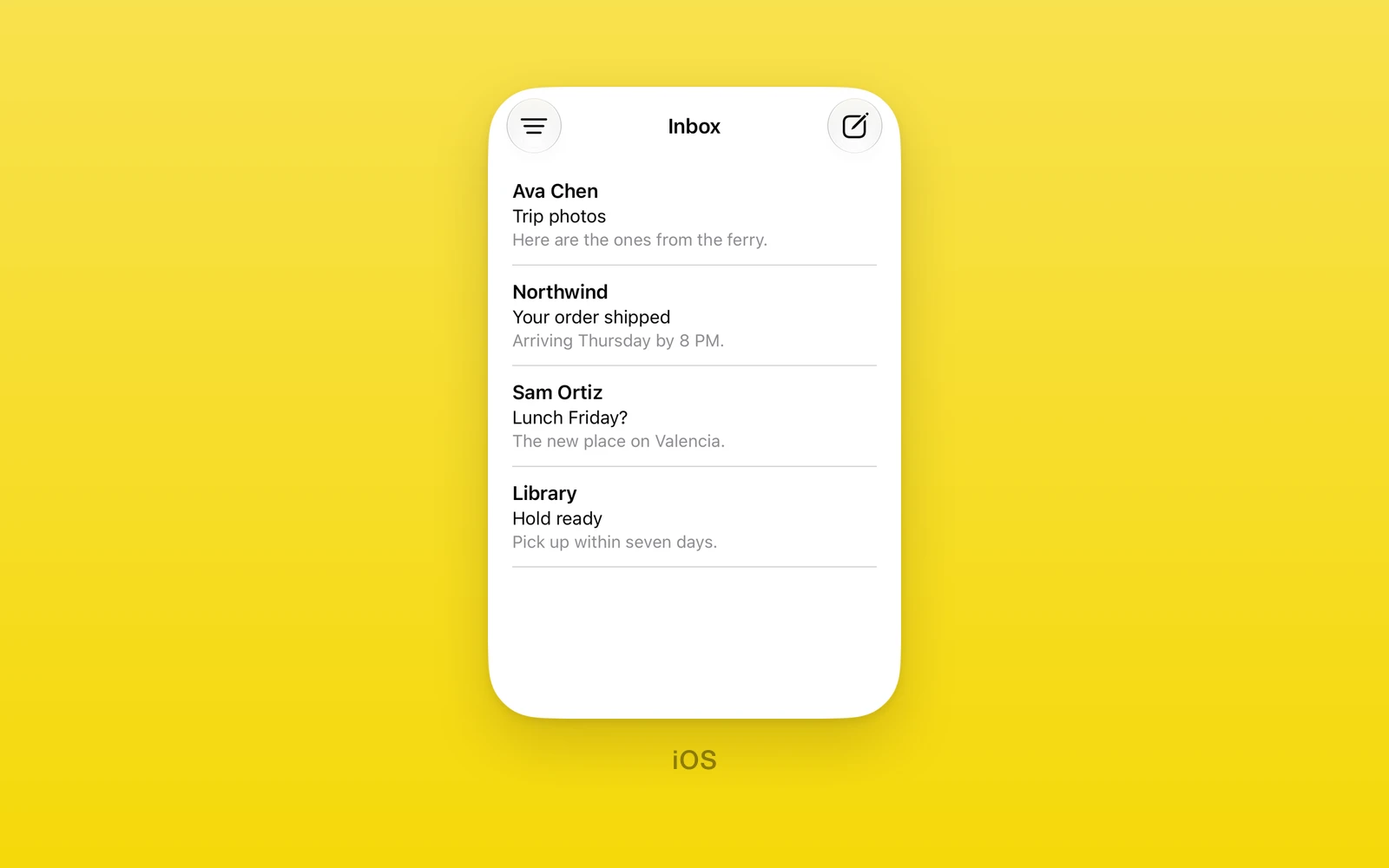
Navigation chrome under One.iOS. This is the SwiftUI toolbar that fills
the navigation bar, distinct from the UIKit navigation toolbar
(One.iOS.ToolbarHost and One.iOS.BarButtonItem) covered in
Toolbar and Menus.
NavigationStack
One.iOS.NavigationStack is a SwiftUI navigation stack whose root is the
React Native content beside it. Children are Toolbar elements (which fill
the navigation bar) or React Native content; ToolbarItem,
ToolbarItemGroup, and ToolbarSpacer belong inside a Toolbar, never
directly in the stack. Navigation title, title display mode, and every
other scalar navigation or toolbar modifier reach the stack through
swiftStyle, so the bar has no bespoke props.
import { One } from 'one'
<One.iOS.NavigationStack> <One.iOS.Toolbar> <One.iOS.ToolbarItem placement="primaryAction"> <One.iOS.Button label="Save" onPress={save} /> </One.iOS.ToolbarItem> </One.iOS.Toolbar> <Content /></One.iOS.NavigationStack>| Props | Type | Description |
|---|---|---|
children (required)ReactNodeToolbar elements and the root content. | ReactNode | Toolbar elements and the root content. |
Set the title with swiftStyle, for example
swiftStyle={{ navigationTitleWithText: 'Mailbox', navigationBarTitleDisplayMode: 'inline' }}.
NavigationSplitView
One.iOS.NavigationSplitView uses SwiftUI’s two or three column split view.
Its direct children are one Sidebar, an optional Content, and one
Detail. Each column accepts React Native content and a column swiftStyle.
Column styles can set their own navigation title and other SwiftUI modifiers.
import { One } from 'one'
<One.iOS.NavigationSplitView  columnVisibility={columnVisibility}  onColumnVisibilityChange={setColumnVisibility}  preferredCompactColumn={compactColumn}  onPreferredCompactColumnChange={setCompactColumn}>  <One.iOS.NavigationSplitView.Sidebar    swiftStyle={{ navigationTitleWithText: 'Mailboxes' }}  >    <One.iOS.Toolbar>      <One.iOS.List selection={selection} onSelectionChange={setSelection}>        {mailboxes.map((mailbox) => (          <One.iOS.Label            key={mailbox.id}            label={mailbox.name}            systemImage="tray"            swiftStyle={{ tag: mailbox.id }}          />        ))}      </One.iOS.List>      <One.iOS.Toolbar.Content>        <One.iOS.ToolbarItem placement="topBarTrailing">          <One.iOS.Button label="Add" onPress={addMailbox} />        </One.iOS.ToolbarItem>      </One.iOS.Toolbar.Content>    </One.iOS.Toolbar>  </One.iOS.NavigationSplitView.Sidebar>  <One.iOS.NavigationSplitView.Detail>    <MessageDetail />  </One.iOS.NavigationSplitView.Detail></One.iOS.NavigationSplitView>
Omit columnVisibility and preferredCompactColumn to let SwiftUI manage
them. Supplying either prop makes it controlled: its callback reports the
native proposal, and the prop remains authoritative until React updates it.
columnVisibility is automatic, all, doubleColumn, or detailOnly;
preferredCompactColumn is sidebar, content, or detail and applies on
iOS 17 or later.
| Props | Type | Description |
|---|---|---|
columnVisibilityNavigationSplitViewVisibility = "automatic"The controlled visibility of the columns. | NavigationSplitViewVisibility = "automatic" | The controlled visibility of the columns. |
onColumnVisibilityChange(visibility: NavigationSplitViewVisibility) => voidReceives a native visibility proposal. | (visibility: NavigationSplitViewVisibility) => void | Receives a native visibility proposal. |
preferredCompactColumnNavigationSplitViewColumn = "sidebar"The controlled compact column. Applies on iOS 17 or later. | NavigationSplitViewColumn = "sidebar" | The controlled compact column. Applies on iOS 17 or later. |
onPreferredCompactColumnChange(column: NavigationSplitViewColumn) => voidReceives a native compact-column proposal. | (column: NavigationSplitViewColumn) => void | Receives a native compact-column proposal. |
children (required)ReactNodeA Sidebar, optional Content, and Detail column. | ReactNode | A Sidebar, optional Content, and Detail column. |
Each column marker is a direct child of NavigationSplitView. Toolbar wraps
that column’s content; its Toolbar.Content child holds the toolbar items.
Use swiftStyle on a column marker for its navigation title and other
column-level modifiers.
Toolbar
One.iOS.Toolbar becomes one native toolbar. In a NavigationStack or
Tabs, its children are ToolbarItem, ToolbarItemGroup, or
ToolbarSpacer elements in order. A split view column uses Toolbar as a
content wrapper and puts those toolbar entries inside Toolbar.Content.
NavigationStack merges every toolbar it is given. One.iOS.Tabs also takes
a Toolbar child.
| Props | Type | Description |
|---|---|---|
children (required)ReactNodeToolbar entries, or column content with a Toolbar.Content marker. | ReactNode | Toolbar entries, or column content with a Toolbar.Content marker. |
Toolbar.Content
One.iOS.Toolbar.Content marks the toolbar entries inside a split view
column’s content wrapper. Its children follow the same order and types as a
regular toolbar.
ToolbarItem
One.iOS.ToolbarItem places one item in the bar.
| Props | Type | Description |
|---|---|---|
placementToolbarItemPlacement = "automatic"Where the item goes. See below. | ToolbarItemPlacement = "automatic" | Where the item goes. See below. |
children (required)ReactNodeThe item, such as a One.iOS.Button. | ReactNode | The item, such as a One.iOS.Button. |
ToolbarItemPlacement is every SwiftUI placement: automatic, principal,
navigation, primaryAction, secondaryAction, status,
confirmationAction, cancellationAction, destructiveAction, keyboard,
topBarLeading, topBarTrailing, topBarPinnedTrailing,
navigationBarLeading, navigationBarTrailing, title, largeTitle,
bottomBar, subtitle, and largeSubtitle. A placement newer than the
running iOS throws.
ToolbarItemGroup
One.iOS.ToolbarItemGroup places several items together.
| Props | Type | Description |
|---|---|---|
placementToolbarItemPlacement = "automatic"Where the group goes. | ToolbarItemPlacement = "automatic" | Where the group goes. |
labelstring = ""Names the group when SwiftUI collapses it. | string = "" | Names the group when SwiftUI collapses it. |
systemImageSFSymbolName | "" = ""An SF Symbol with the label. Needs a label. | SFSymbolName | "" = "" | An SF Symbol with the label. Needs a label. |
children (required)ReactNodeThe items. | ReactNode | The items. |
ToolbarSpacer
One.iOS.ToolbarSpacer spreads toolbar items apart. It needs iOS 26.
| Props | Type | Description |
|---|---|---|
sizingSpacerSizing = "flexible"flexible fills the space; fixed adds a standard gap. | SpacerSizing = "flexible" | flexible fills the space; fixed adds a standard gap. |
placementToolbarItemPlacement = "automatic"The bar the spacer sits in. | ToolbarItemPlacement = "automatic" | The bar the spacer sits in. |
On web and Android these views throw. Keep them behind a platform check.
Edit this page on GitHub.