iOS Stacks
SwiftUI stack layout under One.iOS, with HStack, VStack, ZStack, Spacer, and Slot
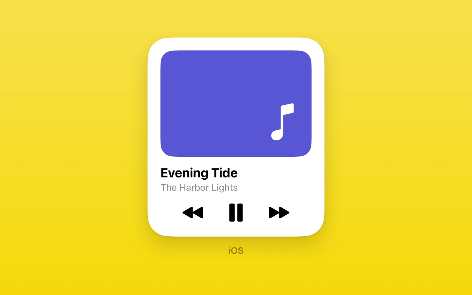
One.iOS stacks lay out SwiftUI views the way SwiftUI does. HStack, VStack,
and ZStack are SwiftUI’s HStack, VStack, and ZStack, with the same
arguments, inside
a React Native Fabric view, so the controls they hold are measured and drawn by
SwiftUI itself. Spacer pushes siblings apart along the stack axis, and Slot
reserves a fixed box for React Native content a measured parent cannot size.
Reach for a stack when a card, row, or form section should look and behave like the system one. Stacks size themselves from their content; when the content is long or two-dimensional, give it its own box with a greedy container from iOS Lists and Forms instead of nesting one inside a stack.
Usage
import { One } from 'one'
function WifiRow() {  return (    <One.iOS.HStack>      <One.iOS.Label label="Wi-Fi" systemImage="wifi" />      <One.iOS.Spacer />      <One.iOS.Text text="Home" />    </One.iOS.HStack>  )}
Spacer expands along the row and pushes the label and the value to opposite
edges. The stack reports SwiftUI’s measured height, so no height is needed.
How it works
Each stack renders through a Fabric view generated from the SwiftUI SDK, such as
OneNativeVStackComponentView, that hosts its SwiftUI content in a
OneNativeHostingController, a UIHostingController subclass. Children
compose into the parent’s hosting controller instead of owning one, so a stack
of controls is a single SwiftUI tree. The container measures that tree and
reports the height back, which is how Yoga sizes the row with no hardcoded
heights.
Stacks stretch to the width they are offered and size their own height. Views
that take the box they are given instead of reporting an ideal height, Form,
List, ScrollView, Tabs, Pager, and NavigationStack, throw when placed
inside a stack; each needs its own box. Children must be SwiftUI views: raw
text or React Native views throw, and React Native content belongs in a Slot.
HStack, VStack
HStack lays children out in a row and VStack in a column. Each takes
SwiftUI’s alignment and spacing: the alignment is a VerticalAlignment for
HStack and a HorizontalAlignment for VStack, and an unset spacing is the
system spacing between each pair of children, as in SwiftUI.
import { One } from 'one'
function SyncCard() {  return (    <One.iOS.VStack spacing={8} style={{ width: '100%' }}>      <One.iOS.HStack>        <One.iOS.Label label="Wi-Fi" systemImage="wifi" />        <One.iOS.Spacer />        <One.iOS.Text text="Home" />      </One.iOS.HStack>      <One.iOS.ProgressView value={0.4} />    </One.iOS.VStack>  )}
The outer stack spaces its rows by 8 points; the inner row spreads its label and value with a spacer, and the progress view fills the card width.
Like every view in One.iOS, a stack takes swiftStyle, the SwiftUI modifiers
you would chain after it. This card gets padding, a rounded background, and a
shadow:
<One.iOS.VStack spacing={8} swiftStyle={{ padding: 16, background: '#F2F2F7', cornerRadius: 12, shadow: { color: 'black', radius: 6, x: 0, y: 2 }, }}> <One.iOS.Text text="Wi-Fi" /> <One.iOS.Text text="Home" /></One.iOS.VStack>A measured stack reports its styled height to Yoga, so the padding counts toward the card’s size.
| HStack props | Type | Description |
|---|---|---|
alignmentHStackAlignment = "center"top, center, bottom, firstTextBaseline, or lastTextBaseline. | HStackAlignment = "center" | top, center, bottom, firstTextBaseline, or lastTextBaseline. |
spacingnumberThe gap between children. Must be zero or more. Unset is the system spacing. | number | The gap between children. Must be zero or more. Unset is the system spacing. |
swiftStyleOneNativeStyleSwiftUI modifiers for this view, such as padding, background, and frame. | OneNativeStyle | SwiftUI modifiers for this view, such as padding, background, and frame. |
children (required)ReactNodeSwiftUI views or Slot boxes. | ReactNode | SwiftUI views or Slot boxes. |
| VStack props | Type | Description |
|---|---|---|
alignmentVStackAlignment = "center"leading, center, trailing, listRowSeparatorLeading, or listRowSeparatorTrailing. | VStackAlignment = "center" | leading, center, trailing, listRowSeparatorLeading, or listRowSeparatorTrailing. |
spacingnumberThe gap between children. Must be zero or more. Unset is the system spacing. | number | The gap between children. Must be zero or more. Unset is the system spacing. |
swiftStyleOneNativeStyleSwiftUI modifiers for this view, such as padding, background, and frame. | OneNativeStyle | SwiftUI modifiers for this view, such as padding, background, and frame. |
children (required)ReactNodeSwiftUI views or Slot boxes. | ReactNode | SwiftUI views or Slot boxes. |
Environment
SwiftUI environment modifiers in swiftStyle apply to the stack’s whole
subtree, as they do in SwiftUI. Unknown value names throw, as do values that
need a newer iOS than the device runs.
import { One } from 'one'
function LargeDarkCard() {  return (    <One.iOS.VStack swiftStyle={{ colorScheme: 'dark', dynamicTypeSize: 'accessibility1' }}>      <One.iOS.Label label="Favorites" systemImage="star" />      <One.iOS.Text text="Every control inside inherits the scheme and type size." />    </One.iOS.VStack>  )}
ZStack
ZStack layers children back to front and takes the size of the largest one.
alignment places the smaller children within it.
import { One } from 'one'
function Badge() {  return (    <One.iOS.ZStack alignment="topTrailing">      <One.iOS.Label label="Inbox" systemImage="tray" />      <One.iOS.Text text="3" />    </One.iOS.ZStack>  )}
The count floats over the label’s top trailing corner, positioned by the stack alignment.
| Props | Type | Description |
|---|---|---|
alignmentZStackAlignment = "center"topLeading, top, topTrailing, leading, center, trailing, bottomLeading, bottom, or bottomTrailing. | ZStackAlignment = "center" | topLeading, top, topTrailing, leading, center, trailing, bottomLeading, bottom, or bottomTrailing. |
swiftStyleOneNativeStyleSwiftUI modifiers for this view, such as padding, background, and frame. | OneNativeStyle | SwiftUI modifiers for this view, such as padding, background, and frame. |
children (required)ReactNodeThe layers, back to front. | ReactNode | The layers, back to front. |
Spacer
Spacer expands along its stack’s axis and pushes its neighbors apart. It must
be inside a stack or another native container.
import { One } from 'one'
function PaddedRow() {  return (    <One.iOS.HStack>      <One.iOS.Text text="Left" />      <One.iOS.Spacer minLength={16} />      <One.iOS.Text text="Right" />    </One.iOS.HStack>  )}
minLength keeps at least 16 points between the two texts even when the row is
squeezed.
| Props | Type | Description |
|---|---|---|
minLengthnumber = 0The least space it leaves. Must be zero or more. | number = 0 | The least space it leaves. Must be zero or more. |
swiftStyleOneNativeStyleSwiftUI modifiers for this view, such as padding, background, and frame. | OneNativeStyle | SwiftUI modifiers for this view, such as padding, background, and frame. |
Slot
Slot reserves a fixed box inside a native container, for React Native content
a measured parent cannot size.
import { Text } from 'react-native'import { One } from 'one'
function MixedRow() {  return (    <One.iOS.HStack>      <One.iOS.Label label="Note" systemImage="star" />      <One.iOS.Slot height={44} width={160}>        <Text>React Native content</Text>      </One.iOS.Slot>    </One.iOS.HStack>  )}
The slot gives the React Native text a 160 by 44 box inside the SwiftUI row. Width 0 fills the width the container offers, but a horizontal stack offers none, so a slot in one takes an explicit width.
| Props | Type | Description |
|---|---|---|
height (required)numberThe box height. Must be above zero. | number | The box height. Must be above zero. |
widthnumber = 0The box width. 0 fills the width offered; inside an HStack, set one. | number = 0 | The box width. 0 fills the width offered; inside an HStack, set one. |
swiftStyleOneNativeStyleSwiftUI modifiers for this view. Inside a `Form` or `List`, row modifiers such as `listRowInsets` and `listRowBackground` reach the hosted row. | OneNativeStyle | SwiftUI modifiers for this view. Inside a `Form` or `List`, row modifiers such as `listRowInsets` and `listRowBackground` reach the hosted row. |
children (required)ReactNodeThe React Native content. | ReactNode | The React Native content. |
Platform differences
| iOS | Android | Web | |
|---|---|---|---|
| Renders | SwiftUI stacks | Throws | Throws |
| Sizing | From SwiftUI | None | None |
| Environment | Applied | None | None |
Limits and gotchas
- Greedy containers cannot live in a stack.
Form,List,ScrollView,Tabs,Pager, andNavigationStacktake the box they are given instead of reporting an ideal height, so placing one inside a stack throws. Give it its own box. - Children must be SwiftUI views. Raw text, numbers, and React Native views
throw; fragments are checked too. Wrap React Native content in a
Slot. SpacerandSlotneed a container. Rendering either outside a native container throws.- Environment values need a supported iOS. Each style name is checked against the device version, so a value from a newer SDK throws on an older phone.
Edit this page on GitHub.